Show Code
library(DBI)
library(duckdb)
library(dplyr)
library(tidyr)
library(forcats)
library(countrycode)
library(plotly)
library(ggplot2)This project is intended for both technical and business audiences, with clear visual insights supported by SQL-based exploration.
For the best visualization experience, browser is recommended - optimization of these exploratory visualizations is limited.
This project was selected for its relevance to real-world business intelligence scenarios and its flexibility as a learning and demonstration tool. The Chinook dataset provides a realistic simulation of sales and customer data, enabling exploration of KPIs commonly used in industries such as retail, e-commerce, and SaaS.
Key focus areas include:
By combining strong SQL capabilities with clear business insight, this project demonstrates how structured data exploration can inform decisions and strategy at scale.
This project aims to provide insights on the following key business questions, with a time-based perspective embedded throughout each analysis to identify trends and changes over time:
The following tools were used to merge, analyze, and present the data:
| Tool | Purpose |
|---|---|
| SQL | Data transformation and KPIs |
| DuckDB | Lightweight, embedded relational database |
| R + Shiny | Dashboard development (R-based) |
| Python + Dash | Dashboard development (Python-based) |
This project demonstrates dashboard development in both R (Shiny) and Python (Dash), highlighting flexibility across technical ecosystems.
[NOTE TO SELF - DELETE ONCE REVISED: This is a work in progress. I plan to make a dashboard with R and one with Python, just to show I can do both. I will update this to reflect the final project once it’s done.]
library(DBI)
library(duckdb)
library(dplyr)
library(tidyr)
library(forcats)
library(countrycode)
library(plotly)
library(ggplot2)import duckdb
import numpy as np
import pandas as pd
import pycountry
import plotly.express as px
import plotly.graph_objects as go
from plotly.subplots import make_subplots
from plotly.graph_objs import Figure
from plotly.colors import sample_colorscaleThe Chinook dataset reveals that revenue is predominantly concentrated in North America and Central Europe, with stable year-over-year trends punctuated by notable regional anomalies—such as Australia’s revenue drop and a Europe-wide spike in 2011—indicating operational or market influences worth deeper exploration. Genre remains consistent overall, but efficiency varies significantly: top genres by revenue-per-track tend to be niche with high engagement, while top artists by total revenue rely on volume across many tracks rather than high per-track returns. Customer retention drops sharply within the first six months but shows unexpected spikes around months 28–33, suggesting irregular purchase behavior or promotional effects. Strategic opportunities include expanding in underpenetrated yet high-value markets, tailoring content and marketing by region and genre, optimizing large but underperforming catalogs, and implementing targeted retention and re-engagement campaigns.
The SQLite version of the data was downloaded and converted into a DuckDB database for this project to take advantage of DuckDB’s speed and in-memory querying capabilities.
The database schema was examined through existing documentation and query-based exploration. A schema diagram was created with dbdiagram.
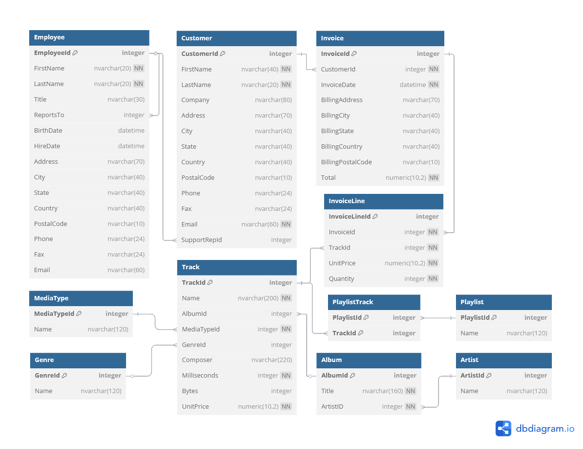
From this schema, key tables of interest were identified for each business question:
Invoice, CustomerInvoice table records total sales and billing address information, which identifies where revenue is being billed geographically. Customer provides customer addressing, which may differ from billing location and allows for a more detailed geographic analysis.InvoiceLine, Track, Artist, GenreInvoiceLine records individual track purchases, including price and quantity. Joining to the Track table provides track-level metadata through further links to Artist and Genre, enabling revenue analysis by artist or genre.Invoice, CustomerCustomer table identifies each buyer, while Invoice records all purchase transactions. Counting invoices per customer reveals how many made repeat purchases, offering insight into customer retention.Invoice, InvoiceLineInvoice table includes invoice dates and total amounts, allowing for time-based trend analysis (e.g., monthly revenue). InvoiceLine can be joined for more granular insights, such as which tracks or genres are trending over specific time periods, or purchase volume trends.With the schema understood and key tables identified, the next step is to query the data using SQL and create exploratory R visualizations to begin answering the business questions.
A connection was made to the DuckDB database file.
con_chinook <- DBI::dbConnect(
  duckdb::duckdb(),
  dbdir = "../data/chinook.duckdb",
  read_only = TRUE
)con_chinook = duckdb.connect("../data/chinook.duckdb", read_only = True)Initial exploration confirmed the data’s structure and date range matched documentation.
A query of date values in the InvoiceDate table confirmed that the data contained records with a date range from 2009-01-01 to 2013-12-22.
SQL
-- Get date range of Invoices
SELECT
  MIN(i.InvoiceDate) as MinDate,
  MAX(i.InvoiceDate) as MaxDate
FROM Invoice i;| MinDate | MaxDate |
|---|---|
| 2009-01-01 | 2013-12-22 |
As expected, InvoiceLine and Track had the highest number of unique records, reflecting their one-to-many relationships with Invoice and Album, respectively. Metadata tables such as Genre and MediaType had fewer unique values.
SQL
-- Get Number of Unique Key Values in Each Table
SELECT
  'Employees' AS TableName,
  COUNT(DISTINCT EmployeeId) AS UniqueKeys
FROM Employee
UNION ALL
SELECT
  'Customers' AS TableName,
  COUNT(DISTINCT Customerid) AS UniqueKeys
FROM Customer
UNION ALL
SELECT
  'Invoices' AS TableName,
  COUNT(DISTINCT InvoiceId) AS UniqueKeys
FROM Invoice
UNION ALL
SELECT
  'Invoice Lines' AS TableName,
  COUNT(DISTINCT InvoiceLineId) AS UniqueKeys
FROM InvoiceLine
UNION ALL
SELECT
  'Tracks' AS TableName,
  COUNT(DISTINCT TrackId) AS UniqueKeys
FROM Track
UNION ALL
SELECT
  'Artists' AS TableName,
  COUNT(DISTINCT ArtistId) AS UniqueKeys
FROM Artist
UNION ALL
SELECT
  'Albums' AS TableName,
  COUNT(DISTINCT AlbumId) AS UniqueKeys
FROM Album
UNION ALL
SELECT
  'Genres' AS TableName,
  COUNT(DISTINCT GenreId) AS UniqueKeys
FROM Genre
UNION ALL
SELECT
  'Media Types' AS TableName,
  COUNT(DISTINCT MediaTypeId) AS UniqueKeys
FROM MediaType
UNION ALL
SELECT
  'Playlists' AS TableName,
  COUNT(DISTINCT PlaylistId) AS UniqueKeys
FROM Playlist
ORDER BY UniqueKeys DESC;| TableName | UniqueKeys |
|---|---|
| Tracks | 3503 |
| Invoice Lines | 2240 |
| Invoices | 412 |
| Albums | 347 |
| Artists | 275 |
| Customers | 59 |
| Genres | 25 |
| Playlists | 18 |
| Employees | 8 |
| Media Types | 5 |
Next Step: Key performance indicators (KPIs) will be extracted with SQL and visualized with R and Python to answer the business questions outlined previously, beginning with a geographic revenue analysis.
Global revenue is highly concentrated, with the U.S., Canada, and France driving over 50% of total earnings. Yet, smaller markets like Chile and Hungary show outsized revenue per customer, indicating growth potential. Geographic disparities in engagement suggest tailored strategies — retention and upsell in large markets, acquisition in high-value niches. Visual analysis also reveals year-specific anomalies that merit further exploration
The data set documented revenue of $2,328.60 (USD) from customers in 24 countries.
Analysis of geographic revenue began with the country recorded in the Invoice table. This geographic value reflected where purchases were billed, which is often used as the default location reference for financial reporting.
SQL
-- Revenue by Country (Billing)
SELECT
    i.BillingCountry,
    SUM(i.Total) AS TotalRevenue,
    ROUND(SUM(i.Total)*100.0 / (SELECT SUM(Total) from Invoice), 2) AS PercentGlobalRevenue,
    COUNT(DISTINCT c.CustomerId) AS NumCustomers,
    ROUND(SUM(i.Total) / COUNT(DISTINCT c.CustomerId), 2) AS RevenuePerCustomer
FROM Customer c
JOIN Invoice i on c.CustomerId == i.CustomerId
GROUP BY i.BillingCountry
-- Sort Revenue (Highest to Lowest)
ORDER BY TotalRevenue DESC;| BillingCountry | TotalRevenue | PercentGlobalRevenue | NumCustomers | RevenuePerCustomer |
|---|---|---|---|---|
| USA | 523.06 | 22.46 | 13 | 40.24 |
| Canada | 303.96 | 13.05 | 8 | 37.99 |
| France | 195.10 | 8.38 | 5 | 39.02 |
| Brazil | 190.10 | 8.16 | 5 | 38.02 |
| Germany | 156.48 | 6.72 | 4 | 39.12 |
| United Kingdom | 112.86 | 4.85 | 3 | 37.62 |
| Czech Republic | 90.24 | 3.88 | 2 | 45.12 |
| Portugal | 77.24 | 3.32 | 2 | 38.62 |
| India | 75.26 | 3.23 | 2 | 37.63 |
| Chile | 46.62 | 2.00 | 1 | 46.62 |
Revenue is geographically concentrated, with a few countries dominating global totals.
Opportunity: Expanding to underrepresented regions could be a growth opportunity, if demand can be identified and activated.
There are different customer behavior patterns in each country.
Opportunities:
However, the Customer table also contained a Country field. Differences between billing and customer country could reflect travel, gift purchases, or mismatched contact vs. billing addresses.
SQL
-- Total Revenue by Country (Customer)
SELECT
    c.Country,
    SUM(i.Total) AS TotalRevenue,
    ROUND(SUM(i.Total)*100.0 / (SELECT SUM(Total) from Invoice), 2) AS PercentGlobalRevenue,
    COUNT(DISTINCT c.CustomerId) AS NumCustomers,
    ROUND(SUM(i.Total) / COUNT(DISTINCT c.CustomerId), 2) AS RevenuePerCustomer
FROM Customer c
JOIN Invoice i on c.CustomerId == i.CustomerId
GROUP BY c.Country
-- Sort Revenue (Highest to Lowest)
ORDER BY TotalRevenue DESC;| Country | TotalRevenue | PercentGlobalRevenue | NumCustomers | RevenuePerCustomer |
|---|---|---|---|---|
| USA | 523.06 | 22.46 | 13 | 40.24 |
| Canada | 303.96 | 13.05 | 8 | 37.99 |
| France | 195.10 | 8.38 | 5 | 39.02 |
| Brazil | 190.10 | 8.16 | 5 | 38.02 |
| Germany | 156.48 | 6.72 | 4 | 39.12 |
| United Kingdom | 112.86 | 4.85 | 3 | 37.62 |
| Czech Republic | 90.24 | 3.88 | 2 | 45.12 |
| Portugal | 77.24 | 3.32 | 2 | 38.62 |
| India | 75.26 | 3.23 | 2 | 37.63 |
| Chile | 46.62 | 2.00 | 1 | 46.62 |
To identify any countries with mismatched revenue attribution, the aggregated views were joined and compared.
SQL
-- Rows with discrepancies in Revenue by Country
-- (Billing vs Customer)

-- Revenue by Invoice.BillingCountry
WITH billing_country_revenue AS (
    SELECT
        BillingCountry AS Country,
        SUM(Total) AS Revenue_Billing
    FROM Invoice
    GROUP BY BillingCountry
),

-- Revenue by Customer Country (joined from Invoice.Customer)
customer_country_revenue AS (
    SELECT
        c.Country AS Country,
        SUM(i.Total) AS Revenue_Customer
    FROM Invoice i
    JOIN Customer c ON i.CustomerId = c.CustomerId
    GROUP BY c.Country
)

-- Join the aggregations into a single table (by Country)
SELECT
    COALESCE(b.Country, c.Country) AS Country,
    b.Revenue_Billing,
    c.Revenue_Customer
FROM billing_country_revenue b
FULL OUTER JOIN customer_country_revenue c
    ON b.Country = c.Country
-- Select only rows where revenue differs by country source
WHERE
  b.Revenue_Billing IS DISTINCT FROM c.Revenue_Customer
ORDER BY Country;| Country | Revenue_Billing | Revenue_Customer |
|---|
Billing and customer country match exactly in this data set, indicating no divergence due to travel, gifting, or alternate addresses. This simplifies location-based analysis but may also reflect a limitation in the data set’s realism.
In preparation for exploratory visualization generation, the data was retrieved using SQL queries and prepared in both R and Python.
# SQL Queries
## Yearly Breakdown
res_yearly_df <- DBI::dbGetQuery(
  con_chinook,
  "SELECT
    -- Get Country and Year for grouping
    i.BillingCountry as Country,
    YEAR(i.InvoiceDate) as Year,
    -- Calculate Total Revenue
    SUM(i.Total) AS TotalRevenue,
    -- Calculate % of Total/Global Revenue
    ROUND(SUM(i.Total)*100.0 / (SELECT SUM(Total) from Invoice), 2) AS PercentGlobalRevenue,
    -- Get Number of Customers
    COUNT(DISTINCT c.CustomerId) AS NumCustomers,
    -- Calculate Revenue per Customer
    ROUND(SUM(i.Total) / COUNT(DISTINCT c.CustomerId), 2) AS RevenuePerCustomer
FROM Customer c
JOIN Invoice i on c.CustomerId == i.CustomerId
GROUP BY i.BillingCountry, Year
-- Sort Revenue (Highest to Lowest)
ORDER BY Year, TotalRevenue DESC;"
)

## Total (all years)
res_agg_df <- DBI::dbGetQuery(
  con_chinook,
  "SELECT
    -- Get Country for grouping
    i.BillingCountry as Country,
    -- Set 'Year' to 'All' for grouping
    'All' AS Year,
    -- Calculate Total Revenue
    SUM(i.Total) AS TotalRevenue,
    -- Calculate % of Total/Global Revenue
    ROUND(SUM(i.Total)*100.0 / (SELECT SUM(Total) from Invoice), 2) AS PercentGlobalRevenue,
    -- Get Number of Customers
    COUNT(DISTINCT c.CustomerId) AS NumCustomers,
    -- Calculate Revenue per Customer
    ROUND(SUM(i.Total) / COUNT(DISTINCT c.CustomerId), 2) AS RevenuePerCustomer
FROM Customer c
JOIN Invoice i on c.CustomerId == i.CustomerId
GROUP BY i.BillingCountry,
-- Sort Revenue (Highest to Lowest)
ORDER BY Year, TotalRevenue DESC;"
)

# Combine data frames in R
res_df <- dplyr::bind_rows(
  res_agg_df,
  res_yearly_df |> dplyr::mutate(Year = as.character(Year))
  ) |>
  dplyr::mutate(
    ## Add ISO Country Codes
    iso_alpha = countrycode::countrycode(
      Country,
      origin = 'country.name',
      destination = 'iso3c'
      ),
    ## Format Hover Text (<b>Country:</b><br> $TotalRevenue.##")
    hover_text = paste0(
      "<b>", Country, ":</b><br> $",
      formatC(TotalRevenue, format = 'f', big.mark =",'", digits = 2)
      )
    )

# Get vector of unique years (layers/traces) - order with "All" first.
years <- c("All", sort(unique(res_yearly_df$Year)))# SQL Queries
## Yearly Breakdown
res_yearly_df = con_chinook.execute(
"""SELECT
-- Get Country and Year for grouping
i.BillingCountry as Country,
YEAR(i.InvoiceDate) as Year,
-- Calculate Total Revenue
SUM(i.Total) AS TotalRevenue,
-- Calculate % of Total/Global Revenue
ROUND(SUM(i.Total)*100.0 / (SELECT SUM(Total) from Invoice), 2) AS PercentGlobalRevenue,
-- Get Number of Customers
COUNT(DISTINCT c.CustomerId) AS NumCustomers,
-- Calculate Revenue per Customer
ROUND(SUM(i.Total) / COUNT(DISTINCT c.CustomerId), 2) AS RevenuePerCustomer
FROM Customer c
JOIN Invoice i on c.CustomerId == i.CustomerId
GROUP BY i.BillingCountry, Year
-- Sort Revenue (Highest to Lowest)
ORDER BY Year, TotalRevenue DESC;"""
).df()
## Total (all years)
res_agg_df = con_chinook.execute(
"""SELECT
-- Get Country for grouping
i.BillingCountry as Country,
-- Set 'Year' to 'All' for grouping
'All' AS Year,
-- Calculate Total Revenue
SUM(i.Total) AS TotalRevenue,
-- Calculate % of Total/Global Revenue
ROUND(SUM(i.Total)*100.0 / (SELECT SUM(Total) from Invoice), 2) AS PercentGlobalRevenue,
-- Get Number of Customers
COUNT(DISTINCT c.CustomerId) AS NumCustomers,
-- Calculate Revenue per Customer
ROUND(SUM(i.Total) / COUNT(DISTINCT c.CustomerId), 2) AS RevenuePerCustomer
FROM Customer c
JOIN Invoice i on c.CustomerId == i.CustomerId
GROUP BY i.BillingCountry,
-- Sort Revenue (Highest to Lowest)
ORDER BY Year, TotalRevenue DESC;"""
).df()
# Combine data frames and ensure consistent types
res_df = pd.concat([
res_agg_df,
res_yearly_df.assign(Year=res_yearly_df['Year'].astype(str))
], ignore_index=True)
# Add ISO Country Codes
def get_iso_alpha3(country_name):
try:
match = pycountry.countries.search_fuzzy(country_name)
return match[0].alpha_3
except LookupError:
return None
res_df['iso_alpha'] = res_df['Country'].apply(get_iso_alpha3)
# Get unique years (layers/traces) - order with "All" first.
years = ["All"] + sorted(res_df[res_df['Year'] != 'All']['Year'].unique().tolist())Total revenue per country across the entire data set was visualized with a Choropeth plot.
# Format Hover Text (<b>Country:</b><br> $TotalRevenue.##")
res_df <- res_df |>
  dplyr::mutate(
    hover_text = paste0(
      "<b>", Country, ":</b><br> $",
      formatC(TotalRevenue, format = 'f', big.mark =",'", digits = 2)
      )
    )

# Get minimum and maximum values for TotalRevenue (Colorbar consistency)
z_min_val <- min(res_df$TotalRevenue, na.rm = TRUE)
z_max_val <- max(res_df$TotalRevenue, na.rm = TRUE)

# Generate plotly Choropleth
fig <- plotly::plot_ly(
  data = res_df,
  type = 'choropleth',
  locations = ~iso_alpha,
  z = ~TotalRevenue,
  # Set hover text to only display our desired, formatted output
  text = ~hover_text,
  hoverinfo = "text",
  frame = ~Year,
  # Set minimum and maximum TotalRevenue values, for consistent scale
  zmin = z_min_val,
  zmax = z_max_val,
  # Title Colorbar/Legend
  colorbar = list(
    title = "Total Revenue (USD$)"
  ),
  # Color-blind friendly color scale
  colorscale = "Viridis",
  reversescale = TRUE,
  showscale = TRUE,
  # Give national boundaries a dark gray outline
  marker = list(line = list(color = "darkgrey", width = 0.5))
)

# Layout with animation controls
fig <- fig %>%
  plotly::layout(
    title = list(
      text = "Total Revenue by Country <br><sub>2009-01-01 to 2013-12-22</sub>",
      x = 0.5,
      xanchor = "center",
      font = list(size = 18)
    ),
    geo = list(
      # Add a neat little frame around the world
      showframe = TRUE,
      # Add coast lines - ensures countries that aren't in data are seen
      showcoastlines = TRUE,
      # Use natural earth projection
      projection = list(type = 'natural earth')
      ),
    updatemenus = list(
      list(
        type = "dropdown",
        showactive = TRUE,
        buttons = purrr::map(years, function(yr) {
          list(
            method = "animate",
            args = list(list(yr), list(mode = "immediate", frame = list(duration = 0, redraw = TRUE))),
            label = yr
          )
        }),
        # Positioning of dropdown menu
        x = 0.1,
        y = 1.15,
        xanchor = "left",
        yanchor = "top"
      )
    ),
    margin = list(t = 80)
  ) %>%
  plotly::animation_opts(frame = 1000, transition = 0, redraw = TRUE)

# Display interactive plot
fig# Specify hover text
res_df['hover_text'] = res_df.apply( \
lambda row: f"<b>{row['Country']}</b><br> ${row['TotalRevenue']:.2f}", axis = 1 \
)
# Get maximum and minimum TotalRevenue values (consistent scale)
z_min_val = res_df['TotalRevenue'].min()
z_max_val = res_df['TotalRevenue'].max()
# Create frames (one per year, and aggregate)
frames = []
for year in years:
df_year = res_df[res_df['Year'] == year]
frames.append(go.Frame(
name = str(year),
data = [go.Choropleth(
locations = df_year['iso_alpha'],
z = df_year['TotalRevenue'],
zmin = z_min_val,
zmax = z_max_val,
text = df_year['hover_text'],
hoverinfo = 'text',
# Color-blind friendly color scale (reversed: darker with higher revenues)
colorscale = 'Viridis_r',
# Give national boundaries a dark grey outline
marker = dict(line=dict(color='darkgrey', width=0.5))
)]
))
# First frame (initial state)
init_df = res_df[res_df['Year'] == 'All']
# Generate plotly Choropleth
fig = go.Figure(
data=[go.Choropleth(
locations=init_df['iso_alpha'],
z=init_df['TotalRevenue'],
text=init_df['hover_text'],
hoverinfo='text',
# Color-blind friendly color scale (reversed: darker with higher revenues)
colorscale='Viridis_r',
zmin=z_min_val,
zmax=z_max_val,
# Give national boundaries a dark grey outline
marker=dict(line=dict(color='darkgrey', width=0.5)),
# Title Colorbar/Legend
colorbar=dict(title='Total Revenue (USD$)')
)],
frames=frames
)
# Format Layout with Animation Controls
fig.update_layout(
title = dict(
text = "Total Revenue by Country <br><sub>2009-01-01 to 2013-12-22</sub>",
x = 0.5,
xanchor = 'center',
font = dict(size=18)
),
margin=dict(t=80),
# Frame and view
geo = dict(
# Show countries and boundaries
showcountries = True,
# Give national boundaries a dark gray outline
countrycolor="darkgrey",
# Add coast lines - ensure countries that aren't in data are seen
showcoastlines = True,
coastlinecolor = "gray",
# Ad a neat little frame around the world
showframe = True,
framecolor = "black",
# Use natural earth projection
projection_type = "natural earth"
),
# Buttons/Menus
updatemenus = [dict(
## Play/Pause
# First button active by default (yr == "All")
type = "buttons",
direction = "left",
x = 0,
y = 0,
showactive = False,
xanchor = "left",
yanchor = "bottom",
pad = dict(r = 10, t = 70),
buttons = [dict(
label = "Play",
method = "animate",
args = [None, {
"frame": {"duration": 1000, "redraw": True},
"fromcurrent": True,
"transition": {"duration": 300, "easing": "quadratic-in-out"}
}]
), dict(
label = "Pause",
method = "animate",
args=[[None], {"frame": {"duration": 0}, "mode": "immediate"}]
)]
)] +
## Year Dropdown Menu
[dict(
type="dropdown",
x = 0.1,
y = 1.15,
xanchor="left",
yanchor="top",
showactive=True,
buttons=[dict(
label=str(year),
method="animate",
args=[
[str(year)],
{"mode": "immediate",
"frame": {"duration": 0, "redraw": True},
"transition": {"duration": 0}}
]
) for year in years]
)],
sliders = [dict(
active = 0,
# Positioning of slider menu
x = 0.1,
y = -0.2,
len = 0.8,
xanchor = "left",
yanchor = "bottom",
pad = dict(t= 30, b=10),
currentvalue = dict(
visible = True,
prefix = "Year: ",
xanchor = "right",
font = dict(size=14, color = "#666")
),
steps = [dict(
method = 'animate',
args =[[str(year)], {
"mode": "immediate",
"frame": {"duration": 1000, "redraw": True},
"transition": {"duration": 300}
}],
label = str(year)
) for year in years]
)]
);
# Display interactive plot
fig.show()The customer base exhibits persistent geographic disparities in both scale and engagement.
Opportunities:
Initial exploration revealed a significant mismatch between total revenue and revenue per customer. This was further explored by forming a similar Choropeth plot.
# Format Hover Text (<b>Country:</b><br> $RevenuePerCustomer.##")
res_df <- res_df |>
  dplyr::mutate(
    hover_text = paste0(
      "<b>", Country, ":</b><br> $",
      formatC(RevenuePerCustomer, format = 'f', big.mark =",'", digits = 2)
      )
    )

# Get minimum and maximum values for RevenuePerCustomer (Colorbar consistency)
z_min_val <- min(res_df$RevenuePerCustomer, na.rm = TRUE)
z_max_val <- max(res_df$RevenuePerCustomer, na.rm = TRUE)

# Generate plotly Choropleth
fig <- plotly::plot_ly(
  data = res_df,
  type = 'choropleth',
  locations = ~iso_alpha,
  z = ~RevenuePerCustomer,
  # Set hover text to only display our desired, formatted output
  text = ~hover_text,
  hoverinfo = "text",
  frame = ~Year,
  # Set minimum and maximum RevenuePerCustomer values, for consistent scale
  zmin = z_min_val,
  zmax = z_max_val,
  # Title Colorbar/Legend
  colorbar = list(
    title = "Revenue per Customer (USD$)"
  ),
  # Color-blind friendly color scale
  colorscale = "Viridis",
  reversescale = TRUE,
  showscale = TRUE,
  # Give national boundaries a dark gray outline
  marker = list(line = list(color = "darkgrey", width = 0.5))
)

# Layout with animation controls
fig <- fig %>%
  plotly::layout(
    title = list(
      text = "Revenue per Customer by Country <br><sub>2009-01-01 to 2013-12-22</sub>",
      x = 0.5,
      xanchor = "center",
      font = list(size = 18)
    ),
    geo = list(
      # Add a neat little frame around the world
      showframe = TRUE,
      # Add coast lines - ensures countries that aren't in data are seen
      showcoastlines = TRUE,
      # Use natural earth projection
      projection = list(type = 'natural earth')
      ),
    updatemenus = list(
      list(
        type = "dropdown",
        showactive = TRUE,
        buttons = purrr::map(years, function(yr) {
          list(
            method = "animate",
            args = list(list(yr), list(mode = "immediate", frame = list(duration = 0, redraw = TRUE))),
            label = yr
          )
        }),
        # Positioning of dropdown menu
        x = 0.1,
        y = 1.15,
        xanchor = "left",
        yanchor = "top"
      )
    ),
    margin = list(t = 80)
  ) %>%
  plotly::animation_opts(frame = 1000, transition = 0, redraw = TRUE)

# Display interactive plot
fig# Specify hover text
res_df['hover_text'] = res_df.apply( \
lambda row: f"<b>{row['Country']}</b><br> ${row['RevenuePerCustomer']:.2f}", axis = 1 \
)
# Get maximum and minimum RevenuePerCustomer values (consistent scale)
z_min_val = res_df['RevenuePerCustomer'].min()
z_max_val = res_df['RevenuePerCustomer'].max()
# Create frames (one per year, and aggregate)
frames = []
for year in years:
df_year = res_df[res_df['Year'] == year]
frames.append(go.Frame(
name = str(year),
data = [go.Choropleth(
locations = df_year['iso_alpha'],
z = df_year['RevenuePerCustomer'],
zmin = z_min_val,
zmax = z_max_val,
text = df_year['hover_text'],
hoverinfo = 'text',
# Color-blind friendly color scale (reversed: darker with higher revenues)
colorscale = 'Viridis_r',
# Give national boundaries a dark grey outline
marker = dict(line=dict(color='darkgrey', width=0.5))
)]
))
# First frame (initial state)
init_df = res_df[res_df['Year'] == 'All']
# Generate plotly Choropleth
fig = go.Figure(
data=[go.Choropleth(
locations=init_df['iso_alpha'],
z=init_df['RevenuePerCustomer'],
text=init_df['hover_text'],
hoverinfo='text',
# Color-blind friendly color scale (reversed: darker with higher revenues)
colorscale='Viridis_r',
zmin=z_min_val,
zmax=z_max_val,
# Give national boundaries a dark grey outline
marker=dict(line=dict(color='darkgrey', width=0.5)),
# Title Colorbar/Legend
colorbar=dict(title='Revenue per Customer (USD$)')
)],
frames=frames
)
# Format Layout with Animation Controls
fig.update_layout(
title = dict(
text = "Revenue per Customer by Country <br><sub>2009-01-01 to 2013-12-22</sub>",
x = 0.5,
xanchor = 'center',
font = dict(size=18)
),
margin=dict(t=80),
# Frame and view
geo = dict(
# Show countries and boundaries
showcountries = True,
# Give national boundaries a dark gray outline
countrycolor="darkgrey",
# Add coast lines - ensure countries that aren't in data are seen
showcoastlines = True,
coastlinecolor = "gray",
# Ad a neat little frame around the world
showframe = True,
framecolor = "black",
# Use natural earth projection
projection_type = "natural earth"
),
# Buttons/Menus
updatemenus = [dict(
## Play/Pause
# First button active by default (yr == "All")
type = "buttons",
direction = "left",
x = 0,
y = 0,
showactive = False,
xanchor = "left",
yanchor = "bottom",
pad = dict(r = 10, t = 70),
buttons = [dict(
label = "Play",
method = "animate",
args = [None, {
"frame": {"duration": 1000, "redraw": True},
"fromcurrent": True,
"transition": {"duration": 300, "easing": "quadratic-in-out"}
}]
), dict(
label = "Pause",
method = "animate",
args=[[None], {"frame": {"duration": 0}, "mode": "immediate"}]
)]
)] +
## Year Dropdown Menu
[dict(
type="dropdown",
x = 0.1,
y = 1.15,
xanchor="left",
yanchor="top",
showactive=True,
buttons=[dict(
label=str(year),
method="animate",
args=[
[str(year)],
{"mode": "immediate",
"frame": {"duration": 0, "redraw": True},
"transition": {"duration": 0}}
]
) for year in years]
)],
sliders = [dict(
active = 0,
# Positioning of slider menu
x = 0.1,
y = -0.2,
len = 0.8,
xanchor = "left",
yanchor = "bottom",
pad = dict(t= 30, b=10),
currentvalue = dict(
visible = True,
prefix = "Year: ",
xanchor = "right",
font = dict(size=14, color = "#666")
),
steps = [dict(
method = 'animate',
args =[[str(year)], {
"mode": "immediate",
"frame": {"duration": 1000, "redraw": True},
"transition": {"duration": 300}
}],
label = str(year)
) for year in years]
)]
);
# Display interactive plot
fig.show()Year-over-year shifts in revenue per customer suggest evolving engagement patterns across regions.
Opportunities:
Total revenue measures market size, while revenue per customer reflects intensity of engagement. Both are important for guiding different types of strategic decisions (e.g., acquisition vs. retention).
Geographic revenue in the Chinook dataset is concentrated in a few strong markets, while many others remain underdeveloped. This disparity presents both risk and opportunity: efforts to deepen engagement in large casual markets (e.g., USA, Brazil) and expand in high-value but small markets (e.g., Austria, Chile) could lead to measurable revenue growth. Year-over-year changes — such as Australia’s exit and Europe’s 2011 spike — suggest that regional trends and operational shifts have meaningful financial impacts worth further investigation.
If this were real-world data, the following actions could strengthen both analytical insight and strategic decision-making.
Deepen the Analysis:
Strategic Business Opportunities:
Revenue across genres and artists is highly concentrated, with a few categories (e.g., Rock, TV-related genres) accounting for most earnings. Yet, when normalized by catalog size, smaller genres like Sci Fi & Fantasy and Bossa Nova outperform in per-track efficiency. These findings suggest that total revenue alone understates the value of high-margin, niche content. Year-over-year trends also reveal temporal spikes that signal short-term demand surges — potential targets for agile promotion or bundling strategies.
To understand commercial performance across the catalog, revenue was analyzed at both the genre and artist levels.
The pertinent sales data was stored in the InvoiceLine table, where each row corresponded to a purchased track. These transaction records were linked to metadata through the Track, Genre, and Artist tables.
Initial exploration focused on genre-level revenue, with metrics capturing total earnings, sales volume, average revenue per track, and share of overall income.
SQL
-- Revenue by Genre
SELECT
  g.Name AS Genre,
  ROUND(SUM(il.UnitPrice * il.Quantity), 2) AS TotalRevenue,
  -- Number of Tracks
  COUNT(*) AS NumTracksSold,
  -- Average Revenue per Track
  ROUND(SUM(il.UnitPrice * il.Quantity)/COUNT(*), 2) AS AvgRevenuePerTrack,
  -- Percentage of Total Revenue
  ROUND(SUM(il.UnitPrice * il.Quantity)*100.0 / (SELECT SUM(UnitPrice * Quantity) FROM InvoiceLine), 2) AS PercentOfRevenue,
  -- Percentage of Volume (Units Sold)
  ROUND(COUNT(*)*100.0 / (SELECT COUNT(*) FROM InvoiceLine),2) AS PercentOfUnitSales,
  -- Total number of tracks in the catalog in this genre
  track_counts.TotalTracksInGenre,
  -- Proportion of catalog that was actually sold
  ROUND(COUNT(DISTINCT il.TrackId) * 100.0 / track_counts.TotalTracksInGenre, 2) AS PercentOfTracksSold,
  -- Revenue per total track in genre
  ROUND(SUM(il.UnitPrice * il.Quantity) / track_counts.TotalTracksInGenre, 2) AS RevenuePerTotalTrack,
FROM InvoiceLine il
JOIN Track t ON il.TrackId = t.TrackId
JOIN Genre g ON t.GenreId = g.GenreId
-- Subquery to get total number of tracks in each genre
JOIN (
    SELECT GenreId, COUNT(*) AS TotalTracksInGenre
    FROM Track
    GROUP BY GenreId
) AS track_counts ON g.GenreId = track_counts.GenreId
GROUP BY g.Name, track_counts.TotalTracksInGenre
-- Arrange by TotalRevenue (Highest to Lowest)
ORDER BY TotalRevenue DESC;| Genre | TotalRevenue | NumTracksSold | AvgRevenuePerTrack | PercentOfRevenue | PercentOfUnitSales | TotalTracksInGenre | PercentOfTracksSold | RevenuePerTotalTrack |
|---|---|---|---|---|---|---|---|---|
| Rock | 826.65 | 835 | 0.99 | 35.50 | 37.28 | 1297 | 57.44 | 0.64 |
| Latin | 382.14 | 386 | 0.99 | 16.41 | 17.23 | 579 | 58.72 | 0.66 |
| Metal | 261.36 | 264 | 0.99 | 11.22 | 11.79 | 374 | 61.76 | 0.70 |
| Alternative & Punk | 241.56 | 244 | 0.99 | 10.37 | 10.89 | 332 | 61.14 | 0.73 |
| TV Shows | 93.53 | 47 | 1.99 | 4.02 | 2.10 | 93 | 46.24 | 1.01 |
| Jazz | 79.20 | 80 | 0.99 | 3.40 | 3.57 | 130 | 52.31 | 0.61 |
| Blues | 60.39 | 61 | 0.99 | 2.59 | 2.72 | 81 | 65.43 | 0.75 |
| Drama | 57.71 | 29 | 1.99 | 2.48 | 1.29 | 64 | 42.19 | 0.90 |
| Classical | 40.59 | 41 | 0.99 | 1.74 | 1.83 | 74 | 48.65 | 0.55 |
| R&B/Soul | 40.59 | 41 | 0.99 | 1.74 | 1.83 | 61 | 60.66 | 0.67 |
Opportunities:
SQL
-- Revenue by Artist
SELECT
  ar.Name AS Artist,
  -- Total Revenue
  ROUND(SUM(il.UnitPrice * il.Quantity), 2) AS TotalRevenue,
  -- Number of Tracks
  COUNT(*) AS NumTracksSold,
  -- Average Revenue per Track Sold
  ROUND(SUM(il.UnitPrice * il.Quantity)/COUNT(*), 2) AS AvgRevenuePerTrack,
  -- Percentage of Total Revenue
  ROUND(SUM(il.UnitPrice * il.Quantity)*100.0 / (SELECT SUM(UnitPrice * Quantity) FROM InvoiceLine), 2) AS PercentOfRevenue,
  -- Percentage of Volume (Units Sold)
  ROUND(COUNT(*)*100.0 / (SELECT COUNT(*) FROM InvoiceLine),2) AS PercentOfUnitSales,
  -- Total number of tracks in the catalog for artist
  track_counts.TotalTracksByArtist,
  -- Proportion of catalog that was actually sold
  ROUND(COUNT(DISTINCT il.TrackId) * 100.0 / track_counts.TotalTracksByArtist, 2) AS PercentOfTracksSold,
  -- Revenue per total track by artist
  ROUND(SUM(il.UnitPrice * il.Quantity) / track_counts.TotalTracksByArtist, 2) AS RevenuePerTotalTrack
FROM InvoiceLine il
JOIN Track t ON il.TrackId = t.TrackId
JOIN Album al ON t.AlbumId = al.AlbumId
JOIN Artist ar ON ar.ArtistId = al.ArtistId
-- Subquery to get total number of tracks in each genre
JOIN (
    SELECT
      al.ArtistId,
      COUNT(*) AS TotalTracksByArtist
    FROM Track t
    JOIN Album al ON t.AlbumId = al.AlbumId
    GROUP BY al.ArtistId
) AS track_counts ON ar.ArtistId = track_counts.ArtistId
GROUP BY ar.Name, track_counts.TotalTracksByArtist
-- Arrange by TotalRevenue (Highest to Lowest)
ORDER BY TotalRevenue DESC
-- Limit output for readability (165 total artists)
LIMIT 25;| Artist | TotalRevenue | NumTracksSold | AvgRevenuePerTrack | PercentOfRevenue | PercentOfUnitSales | TotalTracksByArtist | PercentOfTracksSold | RevenuePerTotalTrack |
|---|---|---|---|---|---|---|---|---|
| Iron Maiden | 138.60 | 140 | 0.99 | 5.95 | 6.25 | 213 | 57.75 | 0.65 |
| U2 | 105.93 | 107 | 0.99 | 4.55 | 4.78 | 135 | 67.41 | 0.78 |
| Metallica | 90.09 | 91 | 0.99 | 3.87 | 4.06 | 112 | 70.54 | 0.80 |
| Led Zeppelin | 86.13 | 87 | 0.99 | 3.70 | 3.88 | 114 | 67.54 | 0.76 |
| Lost | 81.59 | 41 | 1.99 | 3.50 | 1.83 | 92 | 43.48 | 0.89 |
| The Office | 49.75 | 25 | 1.99 | 2.14 | 1.12 | 53 | 41.51 | 0.94 |
| Os Paralamas Do Sucesso | 44.55 | 45 | 0.99 | 1.91 | 2.01 | 49 | 79.59 | 0.91 |
| Deep Purple | 43.56 | 44 | 0.99 | 1.87 | 1.96 | 92 | 44.57 | 0.47 |
| Faith No More | 41.58 | 42 | 0.99 | 1.79 | 1.88 | 52 | 69.23 | 0.80 |
| Eric Clapton | 39.60 | 40 | 0.99 | 1.70 | 1.79 | 48 | 72.92 | 0.82 |
Opportunities:
SQL
-- Top Artists within the Top Genres
SELECT
  g.Name AS Genre,
  ar.Name AS Artist,
  -- Total Revenue
  ROUND(SUM(il.UnitPrice * il.Quantity), 2) AS TotalRevenue,
  -- Number of Tracks Sold
  COUNT(*) AS NumTracksSold,
  -- Percentage of Total Revenue
  ROUND(SUM(il.UnitPrice * il.Quantity) * 100.0 / (SELECT SUM(UnitPrice * Quantity) FROM InvoiceLine), 2) AS PercentOfRevenue,
  -- Average Revenue per Track Sold
  ROUND(SUM(il.UnitPrice * il.Quantity) / COUNT(*), 2) AS AvgRevenuePerTrack,
  -- Percentage of Volume (Units Sold)
  COUNT(DISTINCT il.TrackId) * 100.0 / (SELECT COUNT(DISTINCT TrackId) FROM InvoiceLine) AS PercentOfUnitSales,
  -- Total number of tracks in the catalog for artist-genre combo
  catalog_stats.TotalTracksInCatalog,
  -- Proportion of catalog that was actually sold
  ROUND(COUNT(DISTINCT il.TrackId) * 100.0 / catalog_stats.TotalTracksInCatalog, 2) AS PercentOfCatalogSold,
  -- Revenue per total track by artist-genre combo
  ROUND(SUM(il.UnitPrice * il.Quantity) / catalog_stats.TotalTracksInCatalog, 2) AS RevenuePerCatalogTrack

FROM InvoiceLine il
JOIN Track t ON il.TrackId = t.TrackId
JOIN Album al ON t.AlbumId = al.AlbumId
JOIN Artist ar ON al.ArtistId = ar.ArtistId
JOIN Genre g ON t.GenreId = g.GenreId

-- Subquery to get the total catalog size for each Artist-Genre pair
JOIN (
    SELECT
      al.ArtistId,
      t.GenreId,
      COUNT(*) AS TotalTracksInCatalog
    FROM Track t
    JOIN Album al ON t.AlbumId = al.AlbumId
    GROUP BY al.ArtistId, t.GenreId
) AS catalog_stats
  ON al.ArtistId = catalog_stats.ArtistId AND t.GenreId = catalog_stats.GenreId

GROUP BY g.Name, ar.Name, catalog_stats.TotalTracksInCatalog
-- Arrange by TotalRevenue (Highest to Lowest)
ORDER BY TotalRevenue DESC
-- Limit output for readability (165 total artists)
LIMIT 50;| Genre | Artist | TotalRevenue | NumTracksSold | PercentOfRevenue | AvgRevenuePerTrack | PercentOfUnitSales | TotalTracksInCatalog | PercentOfCatalogSold | RevenuePerCatalogTrack |
|---|---|---|---|---|---|---|---|---|---|
| Metal | Metallica | 90.09 | 91 | 3.87 | 0.99 | 3.981855 | 112 | 70.54 | 0.80 |
| Rock | U2 | 90.09 | 91 | 3.87 | 0.99 | 3.881048 | 112 | 68.75 | 0.80 |
| Rock | Led Zeppelin | 86.13 | 87 | 3.70 | 0.99 | 3.881048 | 114 | 67.54 | 0.76 |
| Metal | Iron Maiden | 69.30 | 70 | 2.98 | 0.99 | 3.074597 | 95 | 64.21 | 0.73 |
| Rock | Iron Maiden | 53.46 | 54 | 2.30 | 0.99 | 2.318548 | 81 | 56.79 | 0.66 |
| TV Shows | Lost | 45.77 | 23 | 1.97 | 1.99 | 1.108871 | 48 | 45.83 | 0.95 |
| Latin | Os Paralamas Do Sucesso | 44.55 | 45 | 1.91 | 0.99 | 1.965726 | 49 | 79.59 | 0.91 |
| Rock | Deep Purple | 43.56 | 44 | 1.87 | 0.99 | 2.066532 | 92 | 44.57 | 0.47 |
| Rock | Queen | 36.63 | 37 | 1.57 | 0.99 | 1.663307 | 45 | 73.33 | 0.81 |
| Rock | Creedence Clearwater Revival | 36.63 | 37 | 1.57 | 0.99 | 1.562500 | 40 | 77.50 | 0.92 |
Opportunities:
In preparation for exploratory visualization generation, the data was retrieved using SQL queries and prepared in both R and Python.
# SQL Queries
## Genre
### Yearly Breakdown
res_genre_yearly_df <- DBI::dbGetQuery(
  con_chinook,
  "SELECT
  -- Get Genre and Year for grouping
  g.Name AS Genre,
  YEAR(i.InvoiceDate) as Year,
  -- Total Revenue
  ROUND(SUM(il.UnitPrice * il.Quantity), 2) AS TotalRevenue,
  -- Number of Tracks
  COUNT(*) AS NumTracksSold,
  -- Average Revenue per Track
  ROUND(SUM(il.UnitPrice * il.Quantity)/COUNT(*), 2) AS AvgRevenuePerTrack,
  -- Percentage of Total Revenue
  ROUND(SUM(il.UnitPrice * il.Quantity)*100.0 / (SELECT SUM(UnitPrice * Quantity) FROM InvoiceLine), 2) AS PercentOfRevenue,
  -- Percentage of Volume (Units Sold)
  ROUND(COUNT(*)*100.0 / (SELECT COUNT(*) FROM InvoiceLine),2) AS PercentOfUnitSales,
  -- Total number of tracks in the catalog in this genre
  track_counts.TotalTracksInGenre,
  -- Proportion of catalog that was actually sold
  ROUND(COUNT(DISTINCT il.TrackId) * 100.0 / track_counts.TotalTracksInGenre, 2) AS PercentOfTracksSold,
  -- Revenue per total track in genre
  ROUND(SUM(il.UnitPrice * il.Quantity) / track_counts.TotalTracksInGenre, 2) AS RevenuePerTotalTrack,
FROM InvoiceLine il
JOIN Invoice i on il.InvoiceId = i.InvoiceId
JOIN Track t ON il.TrackId = t.TrackId
JOIN Genre g ON t.GenreId = g.GenreId
-- Subquery to get total number of tracks in each genre
JOIN (
    SELECT GenreId, COUNT(*) AS TotalTracksInGenre
    FROM Track
    GROUP BY GenreId
) AS track_counts ON g.GenreId = track_counts.GenreId
GROUP BY g.Name, Year, track_counts.TotalTracksInGenre
-- Arrange by TotalRevenue (Highest to Lowest)
ORDER BY Year, TotalRevenue DESC;")

## Aggregate
res_genre_agg_df <- DBI::dbGetQuery(
  con_chinook,
  "SELECT
  -- Get Genre and Year for grouping
  g.Name AS Genre,
  'All' as Year,
  -- Total Revenue
  ROUND(SUM(il.UnitPrice * il.Quantity), 2) AS TotalRevenue,
  -- Number of Tracks
  COUNT(*) AS NumTracksSold,
  -- Average Revenue per Track
  ROUND(SUM(il.UnitPrice * il.Quantity)/COUNT(*), 2) AS AvgRevenuePerTrack,
  -- Percentage of Total Revenue
  ROUND(SUM(il.UnitPrice * il.Quantity)*100.0 / (SELECT SUM(UnitPrice * Quantity) FROM InvoiceLine), 2) AS PercentOfRevenue,
  -- Percentage of Volume (Units Sold)
  ROUND(COUNT(*)*100.0 / (SELECT COUNT(*) FROM InvoiceLine),2) AS PercentOfUnitSales,
  -- Total number of tracks in the catalog in this genre
  track_counts.TotalTracksInGenre,
  -- Proportion of catalog that was actually sold
  ROUND(COUNT(DISTINCT il.TrackId) * 100.0 / track_counts.TotalTracksInGenre, 2) AS PercentOfTracksSold,
  -- Revenue per total track in genre
  ROUND(SUM(il.UnitPrice * il.Quantity) / track_counts.TotalTracksInGenre, 2) AS RevenuePerTotalTrack,
FROM InvoiceLine il
JOIN Track t ON il.TrackId = t.TrackId
JOIN Genre g ON t.GenreId = g.GenreId
-- Subquery to get total number of tracks in each genre
JOIN (
    SELECT GenreId, COUNT(*) AS TotalTracksInGenre
    FROM Track
    GROUP BY GenreId
) AS track_counts ON g.GenreId = track_counts.GenreId
GROUP BY g.Name, Year, track_counts.TotalTracksInGenre
-- Arrange by TotalRevenue (Highest to Lowest)
ORDER BY Year, TotalRevenue DESC;")

## Artist
res_artist_yearly_df <- DBI::dbGetQuery(
  con_chinook,
  "SELECT
  -- Select Artist and Year for Grouping
  ar.Name AS Artist,
  YEAR(i.InvoiceDate) as Year,
  -- Total Revenue
  ROUND(SUM(il.UnitPrice * il.Quantity), 2) AS TotalRevenue,
  -- Number of Tracks
  COUNT(*) AS NumTracksSold,
  -- Average Revenue per Track Sold
  ROUND(SUM(il.UnitPrice * il.Quantity)/COUNT(*), 2) AS AvgRevenuePerTrack,
  -- Percentage of Total Revenue
  ROUND(SUM(il.UnitPrice * il.Quantity)*100.0 / (SELECT SUM(UnitPrice * Quantity) FROM InvoiceLine), 2) AS PercentOfRevenue,
  -- Percentage of Volume (Units Sold)
  ROUND(COUNT(*)*100.0 / (SELECT COUNT(*) FROM InvoiceLine),2) AS PercentOfUnitSales,
  -- Total number of tracks in the catalog for artist
  track_counts.TotalTracksByArtist,
  -- Proportion of catalog that was actually sold
  ROUND(COUNT(DISTINCT il.TrackId) * 100.0 / track_counts.TotalTracksByArtist, 2) AS PercentOfTracksSold,
  -- Revenue per total track by artist
  ROUND(SUM(il.UnitPrice * il.Quantity) / track_counts.TotalTracksByArtist, 2) AS RevenuePerTotalTrack
FROM InvoiceLine il
JOIN Invoice i on il.InvoiceId = i.InvoiceId
JOIN Track t ON il.TrackId = t.TrackId
JOIN Album al ON t.AlbumId = al.AlbumId
JOIN Artist ar ON ar.ArtistId = al.ArtistId
-- Subquery to get total number of tracks in each genre
JOIN (
    SELECT
      al.ArtistId,
      COUNT(*) AS TotalTracksByArtist
    FROM Track t
    JOIN Album al ON t.AlbumId = al.AlbumId
    GROUP BY al.ArtistId
) AS track_counts ON ar.ArtistId = track_counts.ArtistId
GROUP BY ar.Name, Year, track_counts.TotalTracksByArtist
-- Arrange by TotalRevenue (Highest to Lowest)
ORDER BY Year, TotalRevenue DESC;"
)

res_artist_agg_df <- DBI::dbGetQuery(
  con_chinook,
  "SELECT
  -- Select Artist and Year for Grouping
  ar.Name AS Artist,
  'All' as Year,
  -- Total Revenue
  ROUND(SUM(il.UnitPrice * il.Quantity), 2) AS TotalRevenue,
  -- Number of Tracks
  COUNT(*) AS NumTracksSold,
  -- Average Revenue per Track Sold
  ROUND(SUM(il.UnitPrice * il.Quantity)/COUNT(*), 2) AS AvgRevenuePerTrack,
  -- Percentage of Total Revenue
  ROUND(SUM(il.UnitPrice * il.Quantity)*100.0 / (SELECT SUM(UnitPrice * Quantity) FROM InvoiceLine), 2) AS PercentOfRevenue,
  -- Percentage of Volume (Units Sold)
  ROUND(COUNT(*)*100.0 / (SELECT COUNT(*) FROM InvoiceLine),2) AS PercentOfUnitSales,
  -- Total number of tracks in the catalog for artist
  track_counts.TotalTracksByArtist,
  -- Proportion of catalog that was actually sold
  ROUND(COUNT(DISTINCT il.TrackId) * 100.0 / track_counts.TotalTracksByArtist, 2) AS PercentOfTracksSold,
  -- Revenue per total track by artist
  ROUND(SUM(il.UnitPrice * il.Quantity) / track_counts.TotalTracksByArtist, 2) AS RevenuePerTotalTrack
FROM InvoiceLine il
JOIN Track t ON il.TrackId = t.TrackId
JOIN Album al ON t.AlbumId = al.AlbumId
JOIN Artist ar ON ar.ArtistId = al.ArtistId
-- Subquery to get total number of tracks in each genre
JOIN (
    SELECT
      al.ArtistId,
      COUNT(*) AS TotalTracksByArtist
    FROM Track t
    JOIN Album al ON t.AlbumId = al.AlbumId
    GROUP BY al.ArtistId
) AS track_counts ON ar.ArtistId = track_counts.ArtistId
GROUP BY ar.Name, Year, track_counts.TotalTracksByArtist
-- Arrange by TotalRevenue (Highest to Lowest)
ORDER BY Year, TotalRevenue DESC;"
)

# Combine data frames in R
res_genre_df <- dplyr::bind_rows(
  res_genre_agg_df,
  res_genre_yearly_df |> dplyr::mutate(Year = as.character(Year))
  )

res_artist_df <- dplyr::bind_rows(
  res_artist_agg_df,
  res_artist_yearly_df |> dplyr::mutate(Year = as.character(Year))
  )

# Get vector of unique years (layers/traces) - order with "All" first.
years <- c("All", sort(unique(res_genre_yearly_df$Year)))

# Make "Year" an ordered factor (Plot generation ordering)
res_genre_df <- res_genre_df |>
  dplyr::mutate(Year = factor(Year, levels = years, ordered = TRUE))

res_artist_df <- res_artist_df |>
  dplyr::mutate(Year = factor(Year, levels = years, ordered = T))

# Get vector of unique Genres - order by total revenue overall
genres <- res_genre_agg_df |>
  dplyr::arrange(dplyr::desc(TotalRevenue)) |>
  dplyr::select(Genre) |>
  dplyr::distinct() |>
  dplyr::pull()

# Make "Genre" an ordered factor (Plot generation ordering)
res_genre_df <- res_genre_df |>
  dplyr::mutate(
    Genre = factor(Genre, levels = genres, ordered = T)
  )

# Get vector of unique Artists - order by total revenue overall
artists <- res_artist_agg_df |>
  dplyr::arrange(dplyr::desc(TotalRevenue)) |>
  dplyr::select(Artist) |>
  dplyr::distinct() |>
  dplyr::pull()

# Make "Genre" an ordered factor (Plot generation ordering)
res_artist_df <- res_artist_df |>
  dplyr::mutate(
    Genre = factor(Artist, levels = artists, ordered = T)
)# SQL Queries
## Genre
### Yearly Breakdown
res_genre_yearly_df = con_chinook.execute(
"""SELECT
-- Get Genre and Year for grouping
g.Name AS Genre,
YEAR(i.InvoiceDate) as Year,
-- Total Revenue
ROUND(SUM(il.UnitPrice * il.Quantity), 2) AS TotalRevenue,
-- Number of Tracks
COUNT(*) AS NumTracksSold,
-- Average Revenue per Track
ROUND(SUM(il.UnitPrice * il.Quantity)/COUNT(*), 2) AS AvgRevenuePerTrack,
-- Percentage of Total Revenue
ROUND(SUM(il.UnitPrice * il.Quantity)*100.0 / (SELECT SUM(UnitPrice * Quantity) FROM InvoiceLine), 2) AS PercentOfRevenue,
-- Percentage of Volume (Units Sold)
ROUND(COUNT(*)*100.0 / (SELECT COUNT(*) FROM InvoiceLine),2) AS PercentOfUnitSales,
-- Total number of tracks in the catalog in this genre
track_counts.TotalTracksInGenre,
-- Proportion of catalog that was actually sold
ROUND(COUNT(DISTINCT il.TrackId) * 100.0 / track_counts.TotalTracksInGenre, 2) AS PercentOfTracksSold,
-- Revenue per total track in genre
ROUND(SUM(il.UnitPrice * il.Quantity) / track_counts.TotalTracksInGenre, 2) AS RevenuePerTotalTrack,
FROM InvoiceLine il
JOIN Invoice i on il.InvoiceId = i.InvoiceId
JOIN Track t ON il.TrackId = t.TrackId
JOIN Genre g ON t.GenreId = g.GenreId
-- Subquery to get total number of tracks in each genre
JOIN (
SELECT GenreId, COUNT(*) AS TotalTracksInGenre
FROM Track
GROUP BY GenreId
) AS track_counts ON g.GenreId = track_counts.GenreId
GROUP BY g.Name, Year, track_counts.TotalTracksInGenre
-- Arrange by TotalRevenue (Highest to Lowest)
ORDER BY Year, TotalRevenue DESC;"""
).df()
### Aggregate
res_genre_agg_df = con_chinook.execute(
"""SELECT
-- Get Genre and Year for grouping
g.Name AS Genre,
'All' as Year,
-- Total Revenue
ROUND(SUM(il.UnitPrice * il.Quantity), 2) AS TotalRevenue,
-- Number of Tracks
COUNT(*) AS NumTracksSold,
-- Average Revenue per Track
ROUND(SUM(il.UnitPrice * il.Quantity)/COUNT(*), 2) AS AvgRevenuePerTrack,
-- Percentage of Total Revenue
ROUND(SUM(il.UnitPrice * il.Quantity)*100.0 / (SELECT SUM(UnitPrice * Quantity) FROM InvoiceLine), 2) AS PercentOfRevenue,
-- Percentage of Volume (Units Sold)
ROUND(COUNT(*)*100.0 / (SELECT COUNT(*) FROM InvoiceLine),2) AS PercentOfUnitSales,
-- Total number of tracks in the catalog in this genre
track_counts.TotalTracksInGenre,
-- Proportion of catalog that was actually sold
ROUND(COUNT(DISTINCT il.TrackId) * 100.0 / track_counts.TotalTracksInGenre, 2) AS PercentOfTracksSold,
-- Revenue per total track in genre
ROUND(SUM(il.UnitPrice * il.Quantity) / track_counts.TotalTracksInGenre, 2) AS RevenuePerTotalTrack,
FROM InvoiceLine il
JOIN Track t ON il.TrackId = t.TrackId
JOIN Genre g ON t.GenreId = g.GenreId
-- Subquery to get total number of tracks in each genre
JOIN (
SELECT GenreId, COUNT(*) AS TotalTracksInGenre
FROM Track
GROUP BY GenreId
) AS track_counts ON g.GenreId = track_counts.GenreId
GROUP BY g.Name, Year, track_counts.TotalTracksInGenre
-- Arrange by TotalRevenue (Highest to Lowest)
ORDER BY Year, TotalRevenue DESC;"""
).df()
## Arist
### Yearly Breakdown
res_artist_yearly_df = con_chinook.execute(
"""SELECT
-- Select Artist and Year for Grouping
ar.Name AS Artist,
YEAR(i.InvoiceDate) as Year,
-- Total Revenue
ROUND(SUM(il.UnitPrice * il.Quantity), 2) AS TotalRevenue,
-- Number of Tracks
COUNT(*) AS NumTracksSold,
-- Average Revenue per Track Sold
ROUND(SUM(il.UnitPrice * il.Quantity)/COUNT(*), 2) AS AvgRevenuePerTrack,
-- Percentage of Total Revenue
ROUND(SUM(il.UnitPrice * il.Quantity)*100.0 / (SELECT SUM(UnitPrice * Quantity) FROM InvoiceLine), 2) AS PercentOfRevenue,
-- Percentage of Volume (Units Sold)
ROUND(COUNT(*)*100.0 / (SELECT COUNT(*) FROM InvoiceLine),2) AS PercentOfUnitSales,
-- Total number of tracks in the catalog for artist
track_counts.TotalTracksByArtist,
-- Proportion of catalog that was actually sold
ROUND(COUNT(DISTINCT il.TrackId) * 100.0 / track_counts.TotalTracksByArtist, 2) AS PercentOfTracksSold,
-- Revenue per total track by artist
ROUND(SUM(il.UnitPrice * il.Quantity) / track_counts.TotalTracksByArtist, 2) AS RevenuePerTotalTrack
FROM InvoiceLine il
JOIN Invoice i on il.InvoiceId = i.InvoiceId
JOIN Track t ON il.TrackId = t.TrackId
JOIN Album al ON t.AlbumId = al.AlbumId
JOIN Artist ar ON ar.ArtistId = al.ArtistId
-- Subquery to get total number of tracks in each genre
JOIN (
SELECT
al.ArtistId,
COUNT(*) AS TotalTracksByArtist
FROM Track t
JOIN Album al ON t.AlbumId = al.AlbumId
GROUP BY al.ArtistId
) AS track_counts ON ar.ArtistId = track_counts.ArtistId
GROUP BY ar.Name, Year, track_counts.TotalTracksByArtist
-- Arrange by TotalRevenue (Highest to Lowest)
ORDER BY Year, TotalRevenue DESC;"""
).df()
### Aggregate
res_artist_agg_df = con_chinook.execute(
"""SELECT
-- Select Artist and Year for Grouping
ar.Name AS Artist,
'All' as Year,
-- Total Revenue
ROUND(SUM(il.UnitPrice * il.Quantity), 2) AS TotalRevenue,
-- Number of Tracks
COUNT(*) AS NumTracksSold,
-- Average Revenue per Track Sold
ROUND(SUM(il.UnitPrice * il.Quantity)/COUNT(*), 2) AS AvgRevenuePerTrack,
-- Percentage of Total Revenue
ROUND(SUM(il.UnitPrice * il.Quantity)*100.0 / (SELECT SUM(UnitPrice * Quantity) FROM InvoiceLine), 2) AS PercentOfRevenue,
-- Percentage of Volume (Units Sold)
ROUND(COUNT(*)*100.0 / (SELECT COUNT(*) FROM InvoiceLine),2) AS PercentOfUnitSales,
-- Total number of tracks in the catalog for artist
track_counts.TotalTracksByArtist,
-- Proportion of catalog that was actually sold
ROUND(COUNT(DISTINCT il.TrackId) * 100.0 / track_counts.TotalTracksByArtist, 2) AS PercentOfTracksSold,
-- Revenue per total track by artist
ROUND(SUM(il.UnitPrice * il.Quantity) / track_counts.TotalTracksByArtist, 2) AS RevenuePerTotalTrack
FROM InvoiceLine il
JOIN Track t ON il.TrackId = t.TrackId
JOIN Album al ON t.AlbumId = al.AlbumId
JOIN Artist ar ON ar.ArtistId = al.ArtistId
-- Subquery to get total number of tracks in each genre
JOIN (
SELECT
al.ArtistId,
COUNT(*) AS TotalTracksByArtist
FROM Track t
JOIN Album al ON t.AlbumId = al.AlbumId
GROUP BY al.ArtistId
) AS track_counts ON ar.ArtistId = track_counts.ArtistId
GROUP BY ar.Name, Year, track_counts.TotalTracksByArtist
-- Arrange by TotalRevenue (Highest to Lowest)
ORDER BY Year, TotalRevenue DESC;"""
).df()
# Combine data frames and ensure consistent types
res_genre_df = pd.concat([
res_genre_agg_df,
res_genre_yearly_df.assign(Year=res_genre_yearly_df['Year'].astype(str))
], ignore_index=True)
res_artist_df = pd.concat([
res_artist_agg_df,
res_artist_yearly_df.assign(Year=res_artist_yearly_df['Year'].astype(str))
], ignore_index=True)
# Get unique years
years = ["All"] + sorted(res_genre_df[res_genre_df['Year'] != 'All']['Year'].unique().tolist())
# Get unique genres, sorted by total revenue share
genres = (
res_genre_df[res_genre_df['Year'] == 'All']
.sort_values(by='TotalRevenue', ascending=False)['Genre']
.tolist()
)
## Make Genre an ordered categorical (for plots)
res_genre_df['Genre'] = pd.Categorical(
res_genre_df['Genre'],
categories=genres,
ordered=True
)
res_genre_df = res_genre_df.sort_values(['Genre', 'Year'])
# Get unique artists, sorted by total revenue share
artists = (
res_artist_df[res_artist_df['Year'] == 'All']
.sort_values(by='TotalRevenue', ascending=False)['Artist']
.tolist()
)
## Make Artist an ordered categorical (for plots)
res_artist_df['Artist'] = pd.Categorical(
res_artist_df['Artist'],
categories=artists,
ordered=True
)
res_artist_df = res_artist_df.sort_values(['Artist', 'Year'])To better understand genre-level commercial performance, revenue was analyzed both in total and normalized by catalog size. This approach distinguished high-volume genres from those that generated more revenue per available track. The results were visualized with stacked plots to compare total earnings and catalog-adjusted efficiency over time.
# TO DO: Figure out how to get the x-axis values to show

# Stacked Area Plot: Total Revenue by Genre
p1 <- ggplot2::ggplot(
  res_genre_df |>
    dplyr::filter(Year != "All") |>
    dplyr::mutate(Year =  forcats::fct_rev(Year)),
  ggplot2::aes(x = Genre, y = TotalRevenue, fill = Year)
  ) +
  ggplot2::geom_bar(stat="identity") +
  # Format Y-xis into dollars
  ggplot2::scale_y_continuous(labels = scales::dollar) +
  # Labels
  ggplot2::labs(
    title = "Total Revenue",
    x = "Genre",
    y = "Total Revenue (USD$)",
    fill = "Year"
    ) +
  # Colorblind friendly color scheme
  ggplot2::scale_fill_viridis_d() +
  ggplot2::theme_minimal() +
  # Make Legend Vertical, Turn X-axis text horizontal (legibility)
  ggplot2::theme(
    legend.position = "bottom",
    legend.direction = "vertical",
    axis.text.x = ggplot2::element_text(angle = 90, vjust = 0.5, hjust = 1)
    )

# Stacked Area Plot: Revenue per Track in Catalog by Genre
p2 <- ggplot2::ggplot(
  res_genre_df |>
    dplyr::filter(Year != "All") |>
    dplyr::mutate(Year = forcats::fct_rev(Year)),
  ggplot2::aes(x = Genre, y = RevenuePerTotalTrack, fill = Year)
  ) +
  ggplot2::geom_bar(stat="identity") +
  # Format Y-xis into dollars
  ggplot2::scale_y_continuous(labels = scales::dollar) +
  # Labels
  ggplot2::labs(
    title = "Revenue per Track in Catalog",
    x = "Genre",
    y = "Revenue per Track (USD$)",
    fill = "Year"
    ) +
  # Colorblind friendly color scheme
  ggplot2::scale_fill_viridis_d() +
  ggplot2::theme_minimal() +
  # Make Legend Vertical, Remove X-axis label (large text & in prev plot)
  ggplot2::theme(
    legend.position = "bottom",
    legend.direction = "vertical",
    axis.text.x=element_blank()
    )

## Convert to interactive plotly plots
p1_int <- plotly::ggplotly(p1)
p2_int <- plotly::ggplotly(p2)

# For p2, turn off legend for all traces (already in p1)
for (i in seq_along(p2_int$x$data)) {
  p2_int$x$data[[i]]$showlegend <- FALSE
}

# Combine plots and display
plotly::subplot(
  p1_int,
  p2_int,
  nrows = 2,
  shareX = TRUE,
  titleY = TRUE
) %>%
  plotly::layout(
    title = list(text = "Revenue by Genre<br><sup>2009-01-01 to 2013-12-22</sup>"),
    legend = list(orientation = "h", x = 0.5, xanchor = "center", y = -0.1)
)# Filter out "All" year
df = res_genre_df[res_genre_df["Year"] != "All"]
# Sort years in reverse
years_r = sorted(df["Year"].unique(), reverse=True)
# Use a function to suppress intermediate outputs from quarto rendering
def build_plot(df):
# Create subplot
fig = make_subplots(
rows=2, cols=1,
shared_xaxes=True,
vertical_spacing=0.08,
subplot_titles=("Total Revenue", "Revenue per Track in Catalog")
)
# Colorblind-friendly color scheme
colors = sample_colorscale("Viridis", [i/len(years_r) for i in range(len(years_r))])
# Plot 1: Total Revenue
for i, year in enumerate(years_r):
subset = df[df["Year"] == year]
fig.add_trace(
go.Bar(
x=subset["Genre"],
y=subset["TotalRevenue"],
name=str(year),
marker_color=colors[i],
showlegend=True if i == 0 else False # only once for cleaner display
),
row=1, col=1
)
# Plot 1: Revenue per Track in Catalog
for i, year in enumerate(years_r):
subset = df[df["Year"] == year]
fig.add_trace(
go.Bar(
x=subset["Genre"],
y=subset["RevenuePerTotalTrack"],
name=str(year),
marker_color=colors[i],
showlegend=True # show for all so full legend appears
),
row=2, col=1
)
# Format Layout
fig.update_layout(
## Make stacked bar plot
barmode='stack',
title=dict(
text='Revenue by Genre<br><sub>2009-01-01 to 2013-12-22</sub>',
x=0.5,
xanchor='center',
font=dict(size=20)
),
height=700,
margin=dict(t=120),
## Legend on bottom, horizontal
legend=dict(
orientation='h',
yanchor='bottom',
y=-0.25,
xanchor='center',
x=0.5,
title='Year'
)
)
# Format axes
## Y-axis as dollars
fig.update_yaxes(title_text="Total Revenue (USD)", row=1, col=1, tickformat="$,.2f")
fig.update_yaxes(title_text="Revenue per Track (USD)", row=2, col=1, tickformat="$,.2f")
## Ensure only one x-axis shows, rotated (for legibility)
fig.update_xaxes(title_text=None, row=1, col=1)
fig.update_xaxes(title_text="Genre", tickangle=45, row=2, col=1)
# return figure
return fig
# Display plot
fig = build_plot(df)
fig.show()Opportunities:
To better understand artist-level commercial performance, revenue was analyzed both in total and normalized by catalog size. This approach distinguished high-volume artists from those that generated more revenue per available track. The results were visualized with stacked plots to compare total earnings and catalog-adjusted efficiency over time.
# TO DO: Figure out how to make the x-axis values show

# Stacked Area Plot: Total Revenue by Artist
p1 <- ggplot2::ggplot(
  res_artist_df |>
    dplyr::filter(Year != "All") |>
    dplyr::mutate(Year =  forcats::fct_rev(Year)) |>
   ## Restrict to top 20 artists for legibility
    dplyr::filter(Artist %in% artists[1:20]) |>
    dplyr::mutate(Artist = factor(Artist, levels = artists[1:20], ordered = T)),
  ggplot2::aes(x = Artist, y = TotalRevenue, fill = Year)
  ) +
  ggplot2::geom_bar(stat="identity") +
  # Format Y-xis into dollars
  ggplot2::scale_y_continuous(labels = scales::dollar) +
  # Labels
  ggplot2::labs(
    title = "Total Revenue",
    x = "Artist",
    y = "Total Revenue (USD$)",
    fill = "Year"
    ) +
  # Colorblind friendly color scheme
  ggplot2::scale_fill_viridis_d() +
  ggplot2::theme_minimal() +
  # Make Legend Vertical, Turn X-axis text horizontal (legibility)
  ggplot2::theme(
    legend.position = "bottom",
    legend.direction = "vertical",
    axis.text.x = ggplot2::element_text(angle = 90, vjust = 0.5, hjust = 1)
    )

# Stacked Area Plot: Revenue per Track in Catalog by Artist
p2 <- ggplot2::ggplot(
  res_artist_df |>
    dplyr::filter(Year != "All") |>
    dplyr::mutate(Year = forcats::fct_rev(Year)) |>
   ## Restrict to top 20 artists for legibility
    dplyr::filter(Artist %in% artists[1:20]) |>
    dplyr::mutate(Artist = factor(Artist, levels = artists[1:20], ordered = T)),
  ggplot2::aes(x = Artist, y = RevenuePerTotalTrack, fill = Year)
  ) +
  ggplot2::geom_bar(stat="identity") +
  # Format Y-xis into dollars
  ggplot2::scale_y_continuous(labels = scales::dollar) +
  # Labels
  ggplot2::labs(
    title = "Revenue per Track in Catalog",
    x = "Artist",
    y = "Revenue per Track (USD$)",
    fill = "Year"
    ) +
  # Colorblind friendly color scheme
  ggplot2::scale_fill_viridis_d() +
  ggplot2::theme_minimal() +
  # Make Legend Vertical, Remove X-axis label (large text & in prev plot)
  ggplot2::theme(
    legend.position = "bottom",
    legend.direction = "vertical",
    axis.text.x=element_blank()
    )

## Convert to interactive plotly plots
p1_int <- plotly::ggplotly(p1)
p2_int <- plotly::ggplotly(p2)

# For p2, turn off legend for all traces (already in p1)
for (i in seq_along(p2_int$x$data)) {
  p2_int$x$data[[i]]$showlegend <- FALSE
}

# Combine plots and display
plotly::subplot(
  p1_int,
  p2_int,
  nrows = 2,
  shareX = TRUE,
  titleY = TRUE
) %>%
  plotly::layout(
    title = list(text = "Revenue by Artist<br><sup>2009-01-01 to 2013-12-22</sup>"),
    legend = list(orientation = "h", x = 0.5, xanchor = "center", y = -0.1)
)# Filter out "All" year
df = res_artist_df[res_artist_df["Year"] != "All"]
# Restrict to top 20 artists (for legibility)
df = df[df["Artist"].isin(artists[0:20])]
# Use a function to suppress intermediate outputs from quarto rendering
def build_plot(df):
# Sort years in reverse
years_r = sorted(df["Year"].unique(), reverse=True)
# Create subplot
fig = make_subplots(
rows=2, cols=1,
shared_xaxes=True,
vertical_spacing=0.08,
subplot_titles=("Total Revenue", "Revenue per Track in Catalog")
)
# Colorblind-friendly color scheme
colors = sample_colorscale("Viridis", [i/len(years_r) for i in range(len(years_r))])
# Plot 1: Total Revenue
for i, year in enumerate(years_r):
subset = df[df["Year"] == year]
fig.add_trace(
go.Bar(
x=subset["Artist"],
y=subset["TotalRevenue"],
name=str(year),
marker_color=colors[i],
showlegend=True if i == 0 else False # only once for cleaner display
),
row=1, col=1
)
# Plot 1: Revenue per Track in Catalog
for i, year in enumerate(years_r):
subset = df[df["Year"] == year]
fig.add_trace(
go.Bar(
x=subset["Artist"],
y=subset["RevenuePerTotalTrack"],
name=str(year),
marker_color=colors[i],
showlegend=True # show for all so full legend appears
),
row=2, col=1
)
# Format Layout
fig.update_layout(
## Make stacked bar plot
barmode='stack',
title=dict(
text='Revenue by Artist<br><sub>2009-01-01 to 2013-12-22</sub>',
x=0.5,
xanchor='center',
font=dict(size=20)
),
height=700,
margin=dict(t=120),
## Legend on bottom, horizontal
legend=dict(
orientation='h',
yanchor='bottom',
y=-0.25,
xanchor='center',
x=0.5,
title='Year'
)
)
# Format axes
## Y-axis as dollars
fig.update_yaxes(title_text="Total Revenue (USD)", row=1, col=1, tickformat="$,.2f")
fig.update_yaxes(title_text="Revenue per Track (USD)", row=2, col=1, tickformat="$,.2f")
## Ensure only one x-axis shows, rotated (for legibility)
fig.update_xaxes(title_text=None, row=1, col=1)
fig.update_xaxes(title_text="Artist", tickangle=45, row=2, col=1)
# return figure
return fig
# Display plot
fig = build_plot(df)
fig.show()Opportunities:
While overall genre revenue remains stable across years, genre-specific performance varies widely depending on how it’s measured:
These patterns suggest that catalog volume and monetization efficiency are often misaligned. Notably, the top-performing genres by revenue-per-track tend to be narrow in scope but high in engagement, hinting at an opportunity to rebalance the content portfolio.
Artist level trends are similar, suggesting artists with expansive libraries but low per-track revenue may benefit from targeted marketing efforts such as curated collections, remastered releases, or highlight reels that surface their most engaging content.
If this were real-world data, the following actions could strengthen both analytical insight and strategic decision-making.
Deepen the Analysis:
Strategic Business Opportunities:
Invoice, Customer, InvoiceLineCustomer provides key customer data. Links to Invoice provide sales frequency information linked to each Customer, which may be further broken down to individual units or cost-per-unit with links to InvoiceLine.Customer retention patterns reveals rapid decline in retention within the first six months post-purchase, with periodic spikes suggesting promotional or catalog-driven re-engagement. These findings suggest that targeted re-engagement campaigns at the 4-6 months mark and long-term loyalty programs are potential strategies to extend customer lifetime value beyond typical drop-off points (e.g., after 2-3 years).
Initial exploration focused on any difference in average spend per purchase between one-time and repeat purchasers.
SQL
-- Average Spend per Customer (One-time vs Repeat)
-- Purchase count and spend per customer
WITH CustomerPurchases AS (
    SELECT
        CustomerId,
        COUNT(*) AS PurchaseCount,
        SUM(Total) AS TotalSpent
    FROM Invoice
    GROUP BY CustomerId
)
-- Classify customers (One-time vs Repeat), Calculate Avg Spend in Category
SELECT
    CASE
        WHEN PurchaseCount = 1 THEN 'One-Time Buyer'
        ELSE 'Repeat Buyer'
    END AS BuyerType,
    COUNT(*) AS NumCustomers,
    AVG(TotalSpent) AS AvgSpendPerCustomer
FROM CustomerPurchases
GROUP BY BuyerType;| BuyerType | NumCustomers | AvgSpendPerCustomer |
|---|---|---|
| Repeat Buyer | 59 | 39.4678 |
All customers are repeat customers in this data set, indicating no one-time purchase behavior. This simplifies some analyses, but reflects a limitation in the data set’s realism.
Any business with such exceptional customer retention would be ideal for subscription models, loyalty programs, or cross-sells to improve lifetime value of such loyal customers.
To further characterize customer spending patterns, purchase intervals were queried.
SQL
-- Repeat-customer purchase intervals
-- Get date of each customer purchase
WITH CustomerDates AS (
    SELECT
        CustomerId,
        InvoiceId,
        InvoiceDate,
        ROW_NUMBER() OVER (PARTITION BY CustomerId ORDER BY InvoiceDate) AS rn
    FROM Invoice
),

-- Calculate intervals between purchases
DateDiffs AS (
    SELECT
        c1.CustomerId,
        DATE_DIFF('day', c1.InvoiceDate, c2.InvoiceDate) AS DaysBetween
    FROM CustomerDates c1
    JOIN CustomerDates c2
        ON c1.CustomerId = c2.CustomerId
        AND c2.rn = c1.rn + 1
),

-- Aggregate purchases, tracks, and spend per customer
CustomerPurchaseStats AS (
    SELECT
        i.CustomerId,
        COUNT(DISTINCT i.InvoiceId) AS NumPurchases,
        AVG(il.TrackCount) AS AvgTracksPerPurchase,
        AVG(i.Total) AS AvgSpendPerPurchase
    FROM Invoice i
    JOIN (
        SELECT
            InvoiceId,
            COUNT(*) AS TrackCount
        FROM InvoiceLine
        GROUP BY InvoiceId
    ) il ON i.InvoiceId = il.InvoiceId
    GROUP BY i.CustomerId
)

-- Combine everything
SELECT
    s.CustomerId,
    s.NumPurchases,
    s.AvgTracksPerPurchase,
    s.AvgSpendPerPurchase,
    AVG(d.DaysBetween) AS AvgDaysBetweenPurchases
FROM CustomerPurchaseStats s
LEFT JOIN DateDiffs d ON s.CustomerId = d.CustomerId
GROUP BY s.CustomerId, s.NumPurchases, s.AvgTracksPerPurchase, s.AvgSpendPerPurchase
-- Order by average days between purchases (High to Low)
ORDER BY AvgDaysBetweenPurchases DESC;| CustomerId | NumPurchases | AvgTracksPerPurchase | AvgSpendPerPurchase | AvgDaysBetweenPurchases |
|---|---|---|---|---|
| 23 | 7 | 5.428571 | 5.374286 | 298.0000 |
| 21 | 7 | 5.428571 | 5.374286 | 289.1667 |
| 25 | 7 | 5.428571 | 6.088571 | 289.1667 |
| 46 | 7 | 5.428571 | 6.517143 | 289.1667 |
| 8 | 7 | 5.428571 | 5.374286 | 289.1667 |
| 42 | 7 | 5.428571 | 5.660000 | 289.1667 |
| 4 | 7 | 5.428571 | 5.660000 | 289.1667 |
| 29 | 7 | 5.428571 | 5.374286 | 266.0000 |
| 16 | 7 | 5.428571 | 5.374286 | 266.0000 |
| 50 | 7 | 5.428571 | 5.374286 | 266.0000 |
Customers in this data set exhibited uniform purchase behavior in terms of track count per purchase (5.43), highlighting a limitation in the synthetic data set’s realism.
Opportunities:
The retention decay rate was examined as a proxy for cohort retention/retention decay.
SQL
-- Customer repeat rate (monthly return behavior)
-- Obtain First Purchase Date (DuckDB required separate)
WITH FirstPurchase AS (
    SELECT
        CustomerId,
        MIN(DATE(InvoiceDate)) AS FirstPurchaseDate
    FROM Invoice
    GROUP BY CustomerId
),

-- Get subsequent purchase date info from invoice
CustomerInvoices AS (
    SELECT
        i.CustomerId,
        DATE(i.InvoiceDate) AS PurchaseDate,
        fp.FirstPurchaseDate
    FROM Invoice i
    JOIN FirstPurchase fp ON i.CustomerId = fp.CustomerId
),

-- Calculate months since first purchase
RepeatInfo AS (
    SELECT
        CustomerId,
        DATE_DIFF('month', FirstPurchaseDate, PurchaseDate) AS MonthsSinceFirst
    FROM CustomerInvoices
)

-- Count distinct returning customers per month offset
SELECT
    MonthsSinceFirst,
    COUNT(DISTINCT CustomerId) AS ReturningCustomers,
    (SELECT COUNT(*) FROM FirstPurchase) AS CohortSize,
    ROUND(100.0 * COUNT(DISTINCT CustomerId) * 1.0 / (SELECT COUNT(*) FROM FirstPurchase), 1) AS RetentionPct
FROM RepeatInfo
WHERE MonthsSinceFirst > 0
GROUP BY MonthsSinceFirst
-- Arrange by "per month offset" (Low to High)
ORDER BY MonthsSinceFirst;| MonthsSinceFirst | ReturningCustomers | CohortSize | RetentionPct |
|---|---|---|---|
| 1 | 18 | 59 | 30.5 |
| 3 | 22 | 59 | 37.3 |
| 6 | 18 | 59 | 30.5 |
| 7 | 3 | 59 | 5.1 |
| 8 | 1 | 59 | 1.7 |
| 9 | 18 | 59 | 30.5 |
| 10 | 4 | 59 | 6.8 |
| 13 | 6 | 59 | 10.2 |
| 14 | 12 | 59 | 20.3 |
| 18 | 7 | 59 | 11.9 |
Opportunities:
In preparation for exploratory visualization generation, the data was retrieved using SQL queries and prepared in both R and Python.
# SQL Queries
## Retention Decay
res_repeat_df <- DBI::dbGetQuery(
  con_chinook,
  "-- Customer repeat rate (monthly return behavior)
  -- Obtain First Purchase Date (DuckDB required separate)
  WITH FirstPurchase AS (
      SELECT
          CustomerId,
          MIN(DATE(InvoiceDate)) AS FirstPurchaseDate
      FROM Invoice
      GROUP BY CustomerId
  ),

  -- Get subsequent purchase date info from invoice
  CustomerInvoices AS (
      SELECT
          i.CustomerId,
          DATE(i.InvoiceDate) AS PurchaseDate,
          fp.FirstPurchaseDate
      FROM Invoice i
      JOIN FirstPurchase fp ON i.CustomerId = fp.CustomerId
  ),

  -- Calculate months since first purchase
  RepeatInfo AS (
      SELECT
          CustomerId,
          DATE_DIFF('month', FirstPurchaseDate, PurchaseDate) AS MonthsSinceFirst
      FROM CustomerInvoices
  )

  -- Count distinct returning customers per month offset
  SELECT
      MonthsSinceFirst,
      COUNT(DISTINCT CustomerId) AS ReturningCustomers,
      (SELECT COUNT(*) FROM FirstPurchase) AS CohortSize,
      ROUND(100.0 * COUNT(DISTINCT CustomerId) * 1.0 / (SELECT COUNT(*) FROM FirstPurchase), 1) AS RetentionPct
  FROM RepeatInfo
  WHERE MonthsSinceFirst > 0
  GROUP BY MonthsSinceFirst
  -- Arrange by 'per month offset' (Low to High)
  ORDER BY MonthsSinceFirst;"
  )

## Retention Across Cohorts
res_cohort_df <- DBI::dbGetQuery(
  con_chinook,
  "-- Retention across cohorts
  -- First purchase per customer and cohort assignment
  WITH FirstPurchases AS (
      SELECT
          CustomerId,
          MIN(DATE(InvoiceDate)) AS FirstPurchaseDate,
          DATE_TRUNC('month', MIN(InvoiceDate)) AS CohortMonth
      FROM Invoice
      GROUP BY CustomerId
  ),

  -- All purchases labeled with cohort info
  AllPurchases AS (
      SELECT
          i.CustomerId,
          DATE(i.InvoiceDate) AS PurchaseDate,
          DATE_TRUNC('month', i.InvoiceDate) AS PurchaseMonth,
          fp.CohortMonth,
          DATE_DIFF('month', fp.FirstPurchaseDate, i.InvoiceDate) AS MonthsSinceFirst
      FROM Invoice i
      JOIN FirstPurchases fp ON i.CustomerId = fp.CustomerId
  ),

  -- Cohort sizes
  CohortSizes AS (
      SELECT
          CohortMonth,
          COUNT(DISTINCT CustomerId) AS CohortSize
      FROM FirstPurchases
      GROUP BY CohortMonth
  ),

  -- Distinct customer activity per cohort/month
  CustomerActivity AS (
      SELECT DISTINCT
          CustomerId,
          CohortMonth,
          MonthsSinceFirst
      FROM AllPurchases
  )

  -- Final aggregation with cohort size and retention %
  SELECT
      ca.CohortMonth,
      ca.MonthsSinceFirst,
      COUNT(DISTINCT ca.CustomerId) AS NumActiveCustomers,
      cs.CohortSize,
      ROUND(100.0 * COUNT(DISTINCT ca.CustomerId)::DOUBLE / cs.CohortSize, 1) AS RetentionPct
  FROM CustomerActivity ca
  JOIN CohortSizes cs ON ca.CohortMonth = cs.CohortMonth
  GROUP BY ca.CohortMonth, ca.MonthsSinceFirst, cs.CohortSize
  ORDER BY ca.CohortMonth, ca.MonthsSinceFirst;"
)# SQL Queries
## Retention Decay
res_repeat_df = con_chinook.execute(
"""-- Customer repeat rate (monthly return behavior)
-- Obtain First Purchase Date (DuckDB required separate)
WITH FirstPurchase AS (
SELECT
CustomerId,
MIN(DATE(InvoiceDate)) AS FirstPurchaseDate
FROM Invoice
GROUP BY CustomerId
),
-- Get subsequent purchase date info from invoice
CustomerInvoices AS (
SELECT
i.CustomerId,
DATE(i.InvoiceDate) AS PurchaseDate,
fp.FirstPurchaseDate
FROM Invoice i
JOIN FirstPurchase fp ON i.CustomerId = fp.CustomerId
),
-- Calculate months since first purchase
RepeatInfo AS (
SELECT
CustomerId,
DATE_DIFF('month', FirstPurchaseDate, PurchaseDate) AS MonthsSinceFirst
FROM CustomerInvoices
)
-- Count distinct returning customers per month offset
SELECT
MonthsSinceFirst,
COUNT(DISTINCT CustomerId) AS ReturningCustomers,
(SELECT COUNT(*) FROM FirstPurchase) AS CohortSize,
ROUND(100.0 * COUNT(DISTINCT CustomerId) * 1.0 / (SELECT COUNT(*) FROM FirstPurchase), 1) AS RetentionPct
FROM RepeatInfo
WHERE MonthsSinceFirst > 0
GROUP BY MonthsSinceFirst
-- Arrange by "per month offset" (Low to High)
ORDER BY MonthsSinceFirst;"""
).df()
## Retention Across Cohorts
res_cohort_df = con_chinook.execute(
"""-- Retention across cohorts
-- First purchase per customer and cohort assignment
WITH FirstPurchases AS (
SELECT
CustomerId,
MIN(DATE(InvoiceDate)) AS FirstPurchaseDate,
DATE_TRUNC('month', MIN(InvoiceDate)) AS CohortMonth
FROM Invoice
GROUP BY CustomerId
),
-- All purchases labeled with cohort info
AllPurchases AS (
SELECT
i.CustomerId,
DATE(i.InvoiceDate) AS PurchaseDate,
DATE_TRUNC('month', i.InvoiceDate) AS PurchaseMonth,
fp.CohortMonth,
DATE_DIFF('month', fp.FirstPurchaseDate, i.InvoiceDate) AS MonthsSinceFirst
FROM Invoice i
JOIN FirstPurchases fp ON i.CustomerId = fp.CustomerId
),
-- Cohort sizes
CohortSizes AS (
SELECT
CohortMonth,
COUNT(DISTINCT CustomerId) AS CohortSize
FROM FirstPurchases
GROUP BY CohortMonth
),
-- Distinct customer activity per cohort/month
CustomerActivity AS (
SELECT DISTINCT
CustomerId,
CohortMonth,
MonthsSinceFirst
FROM AllPurchases
)
-- Final aggregation with cohort size and retention %
SELECT
ca.CohortMonth,
ca.MonthsSinceFirst,
COUNT(DISTINCT ca.CustomerId) AS NumActiveCustomers,
cs.CohortSize,
ROUND(100.0 * COUNT(DISTINCT ca.CustomerId)::DOUBLE / cs.CohortSize, 1) AS RetentionPct
FROM CustomerActivity ca
JOIN CohortSizes cs ON ca.CohortMonth = cs.CohortMonth
GROUP BY ca.CohortMonth, ca.MonthsSinceFirst, cs.CohortSize
ORDER BY ca.CohortMonth, ca.MonthsSinceFirst;"""
).df()To better understand customer retention over time, a retention decay curve was generated.
# Retention Decay Plot
# Add a column for formatted hover text
res_repeat_df$hover_text <- paste0(
  "Month: ", res_repeat_df$MonthsSinceFirst, "\n",
  "Retention: ", res_repeat_df$RetentionPct, "%"
)

# Retention Curve Line Plot
p <- ggplot2::ggplot(
  res_repeat_df,
  ggplot2::aes(x = MonthsSinceFirst, y = RetentionPct)) +
  # Make line plot - emphasize points
  ggplot2::geom_line(color = "cadetblue4", size = 1.2) +
  ggplot2::geom_point(color = "cadetblue4", size = 2, ggplot2::aes(text = hover_text)) +
  # Mark every 3 months on the x axis
  ggplot2::scale_x_continuous(
    breaks = seq(0, max(res_repeat_df$MonthsSinceFirst), by = 3)
  ) +
  # Label y axis with "%"
  scale_y_continuous(labels = function(x) paste0(x, "%"), limits = c(0, 100)) +
  # Add labels
  ggplot2::labs(
    title = "Customer Retention Decay <br><sub>2009-01-01 to 2013-12-22</sub>",
    x = "Months Since First Purchase",
    y = "Retention (%)"
  ) +
  theme_minimal(base_size = 14)

# Convert to interactive plotly for quarto display
plotly::ggplotly(p, tooltip = "text")# Retention Decay Plot
# Add a column for formatted hover text
res_repeat_df["hover_text"] = (
"Month: " + res_repeat_df["MonthsSinceFirst"].astype(str) + "<br>" +
"Retention: " + res_repeat_df["RetentionPct"].astype(str) + "%"
)
# Use a function to suppress intermediate outputs from quarto rendering
def build_plot(df):
# Initialize the plot
fig = go.Figure()
# Retention Curve Line Plot
fig.add_trace(go.Scatter(
x=res_repeat_df["MonthsSinceFirst"],
y=res_repeat_df["RetentionPct"],
mode="lines+markers",
line=dict(color="cadetblue", width=2),
marker=dict(size=6),
hovertext=res_repeat_df["hover_text"],
hoverinfo="text",
name="Retention"
))
# Labels
fig.update_layout(
title=dict(
text="Customer Retention Decay <br><sub>2009-01-01 to 2013-12-22</sub>",
x=0.5,
xanchor="center",
font=dict(size=20)
),
xaxis=dict(
title="Months Since First Purchase",
tickmode="linear",
tick0=0,
dtick=3
),
yaxis=dict(
title="Retention (%)",
range=[0, 100],
ticksuffix="%"
),
template="plotly_white",
height=500
)
# return figure
return fig
# Display plot
fig = build_plot(res_repeat_df)
fig.show()Opportunities:
For further perspective of customer retention dynamics, a retention heatmap was generated.
# Cohort Retention Heatmap
# Fill in missing Cohort-Month combinations with missing values (`NA`)
res_cohort_df <- tidyr::complete(
  res_cohort_df,
  CohortMonth = seq.Date(
    min(res_cohort_df$CohortMonth),
    max(res_cohort_df$CohortMonth),
    by = "month"
    ),
  MonthsSinceFirst = seq(
    min(res_cohort_df$MonthsSinceFirst),
    max(res_cohort_df$MonthsSinceFirst),
    by = 1
    )
  ) |>
# Filter out any non-included values (Cohort pre Jan 2009, MonthsSince <= 0)
  dplyr::filter(
    MonthsSinceFirst > 0 & CohortMonth >= "2009-01-01"
  )

# Add a column for formatted hover text
res_cohort_df <- res_cohort_df |>
  dplyr::mutate(
    hover_text = ifelse(
      !is.na(RetentionPct),
      paste0(
        "Cohort: ", format(CohortMonth, "%b %Y"), "\n",
        "Cohort Size: ", CohortSize, "\n",
        "Month: ", MonthsSinceFirst, "\n",
        "Retention: ", sprintf("%1.2f%%", RetentionPct)
        ),
      paste0(
        "Cohort: ", format(CohortMonth, "%b %Y"), "\n",
        "Month: ", MonthsSinceFirst, "\n",
        "No data"
        )
      )
    )

# Retention Heatmap
p <- ggplot2::ggplot(
  res_cohort_df,
  ggplot2::aes(
    x = MonthsSinceFirst,
    y = CohortMonth,
    fill = RetentionPct,
    text = hover_text
    )
  ) +
  # Put a white box around each tile
  geom_tile(color = "white", size = 0.2) +
  # Use Color-blind friendly color scheme
  ggplot2::scale_fill_viridis_c(
    # Make empty/missing tiles a gray color - does not transfer to plotly
    na.value = "gray90",
    # Default version
    option = "D",
    # Make higher values a darker color
    direction = -1
  ) +
  # Make x axis evenly marked
  ggplot2::scale_x_continuous(breaks = pretty(res_cohort_df$MonthsSinceFirst)) +
  # Label Y axis in human legible format (Month short name + YYYY)
  ggplot2::scale_y_date(date_breaks = "1 month", date_labels = "%b %Y") +
  # Labels
  ggplot2::labs(
    title = "Customer Retention by Cohort <br><sub>2009-01-01 to 2013-12-22</sub>",
    x = "Months Since First Purchase",
    y = "Cohort Month (First Purchase)",
    fill = "Retention (%)"
  ) +
  # Optional styling
  ggplot2::theme_minimal(base_size = 14) +
  ggplot2::theme(
    axis.text.x = element_text(angle = 45, hjust = 1),
    panel.grid = element_blank()
  )

# Convert to interactive plotly for quarto display
plotly::ggplotly(p, tooltip = "text")# Cohort Retention Heatmap
# Create grid that fills in missing Cohort-Month combinations with missing values (`NA`)
cohort_range = pd.date_range(
start = res_cohort_df['CohortMonth'].min(),
end = res_cohort_df['CohortMonth'].max(),
freq='MS'
)
month_range = range(
res_cohort_df['MonthsSinceFirst'].min(),
res_cohort_df['MonthsSinceFirst'].max() + 1
)
# Create complete combination grid
full_grid = pd.MultiIndex.from_product(
[cohort_range, month_range],
names=['CohortMonth', 'MonthsSinceFirst']
).to_frame(index=False)
## Merge with actual data to fill in missing combinations
res_df = full_grid.merge(
res_cohort_df,
on=['CohortMonth', 'MonthsSinceFirst'],
how='left'
)
# Filter out any non-included values (Cohort pre Jan 2009, MonthsSince <= 0)
res_df = res_df[
(res_df['CohortMonth'] >= pd.to_datetime('2009-01-01')) &
(res_df['MonthsSinceFirst'] > 0)
]
# Create a human-legible version of the cohort month for labels
res_df['CohortLabel'] = res_df['CohortMonth'].dt.strftime('%b %Y')
# Ensure they stay in order
res_df['CohortLabel'] = pd.Categorical(
res_df['CohortLabel'],
ordered=True,
categories=sorted(res_df['CohortMonth'].dt.strftime('%b %Y').unique(), key=lambda x: pd.to_datetime(x))
)
# Add a column for formatted hover text
res_df['hover_text'] = np.where(
~res_df['RetentionPct'].isna(),
"Cohort: " + res_df['CohortMonth'].dt.strftime("%b %Y") +
"<br>Cohort Size: " + res_df['CohortSize'].astype(str) +
"<br>Month: " + res_df['MonthsSinceFirst'].astype(str) +
"<br>Retention: " + (res_df['RetentionPct']).round(2).astype(str) + "%",
"Cohort: " + res_df['CohortLabel'].astype(str) +
"<br>Month: " + res_df['MonthsSinceFirst'].astype(str) +
"<br>No data"
)
# Use a function to suppress intermediate outputs from quarto rendering
def build_plot(df):
# Create pivot tables
retention = df.pivot(index="CohortLabel", columns="MonthsSinceFirst", values="RetentionPct")
text = df.pivot(index="CohortLabel", columns="MonthsSinceFirst", values="hover_text")
# Create heatmap with Plotly
fig = go.Figure(
data=go.Heatmap(
z=retention.values,
x=retention.columns,
y=retention.index,
# Set hover-text
text=text.values,
hoverinfo='text',
# Colorblind-friendly color scheme (Reverse - darker is higher %)
colorscale='Viridis_r',
zmin=0,
zmax=100,
colorbar=dict(title="Retention (%)"),
showscale=True,
hoverongaps=False,
zauto=False
)
)
# Layout (Labels)
fig.update_layout(
title="Customer Retention by Cohort<br><sub>2009-01-01 to 2013-12-22</sub>",
xaxis_title="Months Since First Purchase",
yaxis_title="Cohort Month (First Purchase)",
xaxis=dict(type='category'),
yaxis=dict(type='category'),
height=600
)
# return figure
return fig
# Display plot
fig = build_plot(res_df)
fig.show()Opportunities:
Customer retention drops steeply within the first 6 months after initial purchase, with retention falling below 20% beyond month 42. This indicates that long-term engagement is limited, and most customers do not return frequently after their initial purchases. Unexpected spikes in retention at months 28–33 suggest irregular purchase cycles or promotional triggers. These spikes are consistent across cohorts, especially in later cohorts after September 2009.
If this were real-world data, the following actions could strengthen both analytical insight and strategic decision-making.
Deepen the Analysis:
Strategic Business Opportunities:
Revenue is primarily driven by North American and Central European markets, with consistent year-over-year patterns. However, anomalies like Australia’s steep revenue decline post-2011 and Europe’s spike in the same year suggest operational shifts or market events that merit further investigation. Markets like the USA and Brazil offer growth potential through deeper engagement, while smaller but lucrative markets such as Austria and Chile present attractive expansion opportunities.
Overall genre revenue is stable, but there is considerable variation in monetization efficiency. High revenue-per-track genres tend to be narrowly focused with strong audience engagement, whereas top artists by total revenue typically generate income through large catalogs with lower revenue per track. Artists with expansive libraries and low per-track returns could benefit from marketing strategies like curated collections or remastered releases to surface their most compelling content.
Retention declines steeply in the first six months after purchase, with an unusual spike in months 28–33, possibly due to promotional campaigns or irregular buying cycles. Understanding these patterns is critical to designing effective re-engagement and loyalty programs.
If this were real-world data, the following actions could strengthen both analytical insight and strategic decision-making.