Chinook BI Dashboard: SQL-Driven Insights for a Digital Music Store
A recruiter-ready showcase of SQL-powered storytelling and dashboard engineering
This project demonstrates applied analytics workflows anchored in real business questions using a structured but compact dataset. Inspired by business intelligence toolchains, it combines SQL-driven data modeling with interactive dashboards across R (Shiny), Python, and Tableau. Each deliverable highlights how I approach KPIs, retention metrics, and executive-level insights—core skills that translate across industries and team functions.
Why This Matters
In fast-paced, data-driven organizations, analysts and decision-makers rely on clear, actionable insights from messy or evolving data. This project was built to spotlight:
- End-to-end analytics: data exploration → SQL ETL → dashboard design
- SQL proficiency across joins, windows, staging, and KPI calculation
- Dashboard interfaces tailored for technical and non-technical users
- Cross-platform fluency in R, Python and, Tableau
- Modular architecture designed for scalability and reuse
Designed with interview walkthroughs in mind, this portfolio piece simulates the analytical cycles common in business contexts—where performance, clarity, and speed matter. It reflects how thoughtful engineering and data storytelling can bridge gaps between raw data and real decisions.
Business Questions
Throughout this project, I explored key questions relevant to business strategy, customer behavior, and performance insights, with a time-based perspective embedded in each analysis:
- Where is revenue coming from geographically?
- What genres or artists generate the most income?
- How many customers are repeat buyers?
These questions shaped both the exploratory analysis and the design of each dashboard panel.
Deliverables
To showcase the analytics pipeline across multiple formats, I produced the following deliverables. Each highlights a different stage—from insight development to stakeholder-ready dashboards:
| Deliverable | Description |
|---|---|
| Static Report | Exploratory deep dive using R & Python with SQL-backed plots |
| R + Shiny Dashboard | Interactive dashboard with modular components and KPI filters |
| Python + Dash Dashboard | Dashboard with Plotly and DuckDB SQL |
| Tableau Workbook | Clean visualization interface for non-coders |
Exploratory Report
This report performs a structured deep dive into the dataset to identify key patterns, trends, and opportunities. It frames strategic business questions in a readable format and sets the stage for later dashboard design.
It’s built in Quarto and hosted on this site. Visualizations include time-series charts, choropleth maps, cohort retention heatmaps, all paired with summary insights and strategy callouts.
➡️ View Report
Tech Stack
| Tool | Purpose |
|---|---|
| SQL | KPI calculations, data cleaning |
| DuckDB | Lightweight SQL backend |
| ggplot2 | Static plots in R |
| plotly | Interactive plots in R & Python |
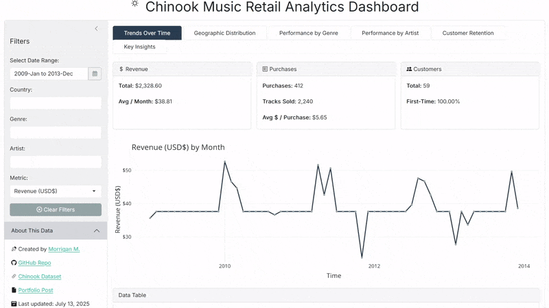
R + Shiny Dashboard
Designed as an interactive walkthrough, this dashboard showcases how SQL-powered insights can drive filtering, visuals, and decision-support. The dashboard includes genre, artist, country, and time filters with dedicated panels for temporal trends, geographic distribution, performance by genre and artist, customer retention, and narrative key insights. Key KPIs are identified and displayed on all panels.
🔗 GitHub Repo: corvidfox/chinook-dashboard-rshiny
🌐 Live App: Hosted on Posit Connect
Key Features
- SQL-powered joins, CTEs, windows for KPIs
- Genre, country, artist, and date filtering
- KPI staging via temp tables
- Retention analysis with cohort logic and decay curves
- Narrative-driven “Insights Panel” for strategic summaries
- Modular Shiny architecture with responsive UX
- Light/dark theming via
bslib, with plot restyling
Tech Stack
| Tool | Purpose |
|---|---|
| R + Shiny | Dashboard interface & logic |
| DuckDB | SQL query backend |
| ggplot2 | Visualizations |
| Plotly | Interactive charts |
| bslib | Light/dark UI styling |
| cachem | Reactivity optimization |
Additional narrative technical details are also provided in the app itself. On the “Key Insights” panel, look for the “Technical Notes” section.
Preview
Python + Dash Dashboard
This dashboard mirrors the R+Shiny build while fully reimagining the app in Python’s Dash ecosystem. It demonstrates scalable architecture, SQL-powered filtering, and performance-focused engineering using DuckDB and Plotly. The interface responds to filters for country, genre, artist, and time—generating KPI cards, plots, and data tables across panels for trend analysis, geographic performance, retention insights, and strategic
🔗 GitHub Repo: corvidfox/chinook-dashboard-pydash
🌐 Live App: Hosted on Render
Key Features
- SQL-based staging and temp tables for efficient query logic
- Dash Mantine Components for unified light/dark theming
- KPI cards generated from reusable helpers with metadata enrichment
- Skeleton loaders and spinners for responsive UX during refresh
- Narrative panel with contextual insights and technical documentation
- DuckDB powering all analytics in read-only mode
- Cached function calls and global connection sharing for speed
Tech Stack
| Tool | Purpose |
|---|---|
| Python + Dash | Web interface and dashboard interactivity |
| DuckDB | Lightweight SQL backend |
| Plotly | Charts and maps |
| dash-mantine-components | UI theming and layout |
| Flask-Caching | Function memoization and data reuse |
| Gunicorn | WSGI deployment server |
| Render | Cloud hosting with environment config |
This deliverable was built as a platform-native alternative to the Shiny version, emphasizing component reuse, production-readiness, and cross-platform fluency.
Preview
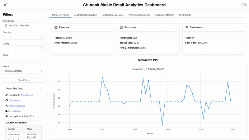
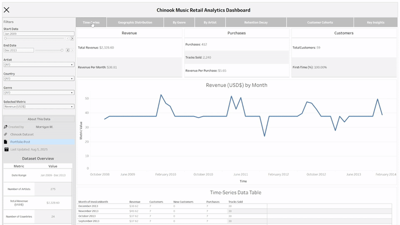
Tableau Dashboard
As a final translation, this Tableau dashboard replicates the same KPIs, insights, and filtering experience as the R and Python versions, this time optimized for point-and-click consumption by business users. It’s designed to demonstrate fluency across platforms and provide an accessible, “no-code” interface for stakeholders.
The dashboard features collapsible filters for genre, artist, country, and time range, with dynamic KPI cards, time-series visualizations, and ranked charts across geography, genre, and artist. Retention metrics are presented using cohort analysis and decay curves, while the “Key Insights” panel includes executive summaries and side-by-side KPI comparisons. All visualizations are interactive, with tooltips, scrollable tables, and hover-based highlights.
Key Features
- Filterable interface for business and non-technical users
- Metric selection and dynamic drill-downs by country, genre, artist, and time
- Stacked bar and area plots for per-genre and per-artist trends
- Retention visualizations via decay curve and cohort heatmap
- Executive “Insights” panel with summary stats and strategic flags
- Fully hosted and accessible via Tableau Public
While this version offers an approachable UI, it trades off engineering flexibility compared to Shiny or Dash. Tableau was used here to demonstrate adaptability to industry-standard BI tools, even when platform limitations restrict analytical depth or design precision.
Tech Stack
| Tool | Purpose |
|---|---|
| Tableau | Visualization and dashboard interface |
| .hyper files | Extracts prepared from DuckDB via Python |
| Python | Data prep and transformation before import |
Preview